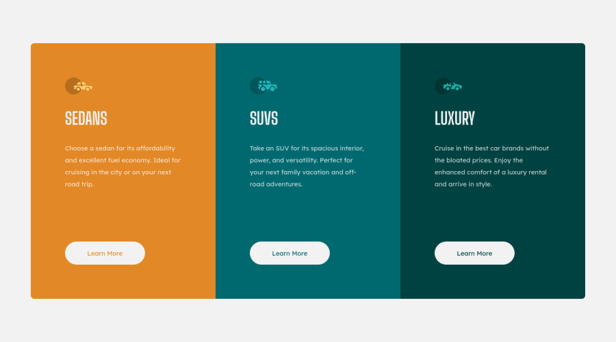
Design comparison
SolutionDesign
Community feedback
- @VCaramesPosted about 2 years ago
Hey there! 👋 Here are some suggestions to help improve your code:
-
Increase 📈 the
widthof the component to better match the FEM design. -
At 891px your content begins to break apart, you will want to check your code to see what is causing this.
-
Your "buttons" were created with the incorrect element. When the user clicks on the button they should be directed to a different part of you site. The
Anchor Tagwill achieve this.
If you have any questions or need further clarification, feel free to reach out to me.
Happy Coding! 🍂🦃
Marked as helpful0 -
Please log in to post a comment
Log in with GitHubJoin our Discord community
Join thousands of Frontend Mentor community members taking the challenges, sharing resources, helping each other, and chatting about all things front-end!
Join our Discord
