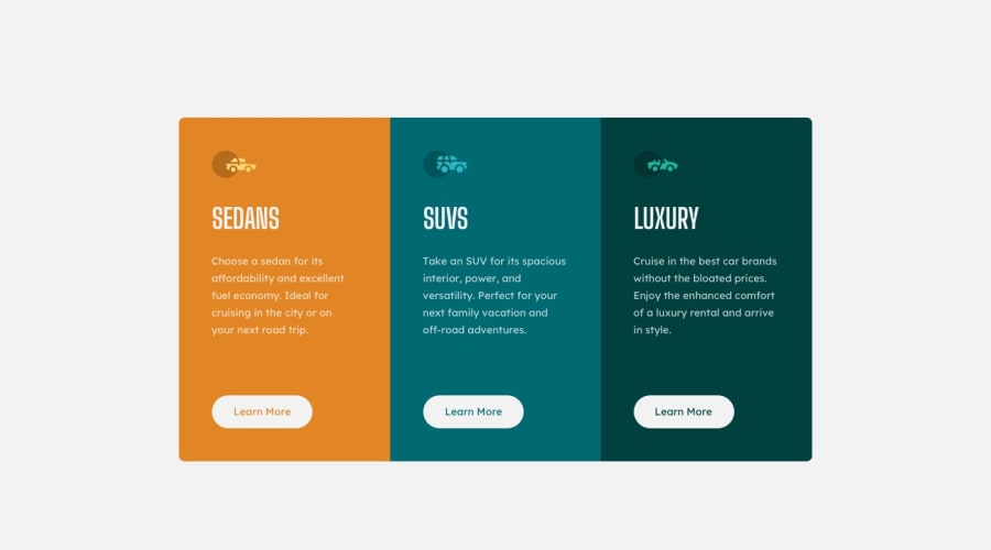
Design comparison
Solution retrospective
Hello ! Here is my fifth challenge and I am very proud of the result despite the time spent and after doing some research. Now it is your turn to help me since I would like to have some feedback on the project. How can I improve? What good can I add to make the code more readable and consistent and make the site nice to see.
Community feedback
- @adityaphasuPosted over 1 year ago
Hi!
Nice solution!
One thing I'd like to point out though is that Learn More is actually an anchor (
<a>) tag and not a paragraph. So in your code replace<p>with<a>and just adddisplay: inline-blockto the existing class.- When setting font size instead of using absolute units like
pxtry using relative units likeremas they are better for scalable layouts. You can read more about it here! - Generally it is recommended to only use 1
<h1>per page so instead of using 3h1s you can change them withh2s. You can also add a h1 to the page but make it only visible for screen readers. You can do something like 3 column card component as a text and just add asr-onlyclass with the following CSS:
position: absolute;
width: 1px;
height: 1px;
padding: 0;
margin: -1px;
overflow: hidden;
clip: rect(0, 0, 0, 0);
white-space: nowrap;
border-width: 0;
This way the design won't be disrupted with h1 but the code will be much more semantic and accessible!
Overall nicely done but with a few more improvements it will be better!
Keep up the hard work and happy coding!🕺🏻
Marked as helpful0 - When setting font size instead of using absolute units like
Please log in to post a comment
Log in with GitHubJoin our Discord community
Join thousands of Frontend Mentor community members taking the challenges, sharing resources, helping each other, and chatting about all things front-end!
Join our Discord
