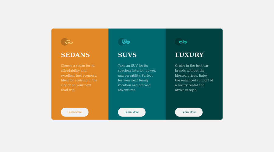
Responsive 3-column preview page using HTML and CSS gris
Design comparison
Solution retrospective
Open to all feedback.
Community feedback
- @VCaramesPosted almost 2 years ago
Hey there! 👋 Here are some suggestions to help improve your code:
- The “car images/icons” in this component are purely decorative; They add no value. So their
Alt Tagshould be left blank and have anaria-hidden=“true”to hide them from assistive technology.
More Info:📚
https://www.w3.org/WAI/tutorials/images/
- The headings in your component are being used incorrectly. Since the
h1heading can only be used once, it is always given to the heading with the highest level of importance. This component has three headings of equal importance, so the best option would be to use anh2heading since it is reusable and it will give each heading the same level of importance.
- Your "buttons" were created with the incorrect element. When the user clicks on the button they should be directed to a different part of you site. The
anchor tagwill achieve this.
More Info:📚
If you have any questions or need further clarification, feel free to reach out to me.
Happy Coding!🎄🎁
Marked as helpful0@Ambe-Mbong-NwiPosted almost 2 years ago@vcarames Thanks very much for your contribution
1 - The “car images/icons” in this component are purely decorative; They add no value. So their
- @AdrianoEscarabotePosted almost 2 years ago
Hello Ambe Mbong-Nwi Nchang, how are you? I truly loved your project's outcome, however I have some advice that I hope you'll find useful:
I noticed that you used a
buttonin which case the best option would be ana, because in my head when a person clicks on a button written Learn More, he is not confirming a form, or something like, it will be redirected to another page, to Learn More about!to solve this problem do this:
<a href="/">Learn More</a>I noticed that the content is going to the side, to solve this problem, we can do the following:
body {
    margin: 0 auto;
}
The remainder is excellent.
I hope it's useful. 👍
Marked as helpful0@Ambe-Mbong-NwiPosted almost 2 years ago@AdrianoEscarabote Thanks very much
0 - @catherineisonlinePosted almost 2 years ago
Hey, looks great! Might want to change cursor: pointer for the buttons
0
Please log in to post a comment
Log in with GitHubJoin our Discord community
Join thousands of Frontend Mentor community members taking the challenges, sharing resources, helping each other, and chatting about all things front-end!
Join our Discord
