Design comparison
SolutionDesign
Solution retrospective
Hi there ✌️!
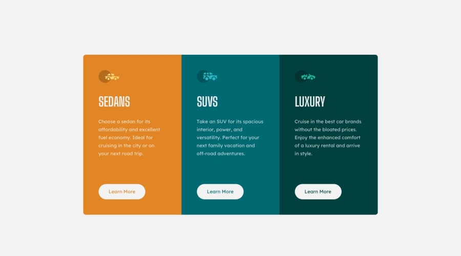
I find out orange in this color palette does not contrast with white, so accessibility score is lower.
How do you improve this issue?
Does it really matter?
Thanks!
Community feedback
Please log in to post a comment
Log in with GitHubJoin our Discord community
Join thousands of Frontend Mentor community members taking the challenges, sharing resources, helping each other, and chatting about all things front-end!
Join our Discord
