Design comparison
SolutionDesign
Solution retrospective
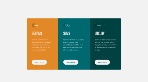
In this project, I took a previous mistake and made it better in terms of unit usage and layout. If anyone can give advice or improve any part, you can give me a feedback. Thank you.
Community feedback
- @WebDevMirzaPosted almost 2 years ago
Hi,
HTML:
- Instead of using
button
for navigating to another page,<a></a>
is the best approach.button
is mainly use for submitting data to the server. - Wrap the entire
attribution
with<footer></footer>
to solve accessibility warning that you have now.
<footer> <div class="attribution"> Challenge by <a href="https://www.frontendmentor.io?ref=challenge" target="_blank">Frontend Mentor</a>. Coded by <a href="https://www.frontendmentor.io/profile/Upond">Chanawin Kamolpanus</a>. </div> </footer>
CSS
- add the following code for button for a hand cursor 👆.
button { cursor: pointer; }
- You may add some transition effect for better UX.
button:hover { color: hsl(0, 0%, 95%); border: 2px solid hsl(0, 0%, 95%); background-color: transparent; transition: all 0.25s 0s linear; }
The rest of the part is fine. Well done. Keep the good work on. 😃 👍
Marked as helpful1@Chanawin-kmpnPosted almost 2 years ago@WebDevMirza Thank for feedback. At first, I thought I must have forgotten something on the learn more
button
it was changing the cursor, now I changed it to<a></a>
and added a `footer'. I'll be more careful with it.1 - Instead of using
Please log in to post a comment
Log in with GitHubJoin our Discord community
Join thousands of Frontend Mentor community members taking the challenges, sharing resources, helping each other, and chatting about all things front-end!
Join our Discord