Design comparison
SolutionDesign
Solution retrospective
I´m glad to receive feedback :)
Community feedback
- @correlucasPosted over 2 years ago
👾Hello Poncho, congratulations for your new solution!
I saw your live site solution right now and everything seems okay.
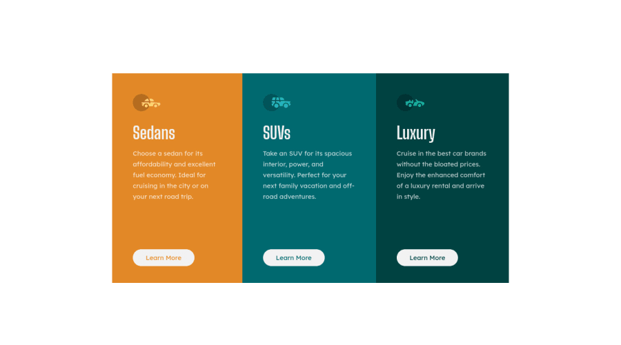
Something you can improve is by giving some semantic tags for the cards, instead of using div try to replace with
articleorsection. Note that div are block elements without meaning, so use it for small content blocks and not for the important ones.The component has a
border-radius: 12pxand you need to add it to the third and first card.👋 I hope this helps you and happy coding!
Marked as helpful1
Please log in to post a comment
Log in with GitHubJoin our Discord community
Join thousands of Frontend Mentor community members taking the challenges, sharing resources, helping each other, and chatting about all things front-end!
Join our Discord
