Design comparison
Solution retrospective
Completed another one! 2 full weeks of these beginner projects and I think I'm sort of getting the hang of things! I know I still have a lot to improve on but it's a huge improvement from the first week lol. Thanks all for your feedback, I do read all of them even if I do not get to respond to each one :D.
Community feedback
- @HassiaiPosted almost 2 years ago
To center .cars on the page using grid, add min-height: 100vh to the body.
In the modile design , there is no need to give . cars a min-width value, reduce the max-width value for .cars e.g:
.cars{ max-width: 350px;}
give .content the same padding value for all the sides. .content{ padding: 3rem;}
In the media query increase the max-width value for .cars e.g:
.cars{max-width: 900px}
there is no need to give .cars a margin value.Hope am helpful.
Well done for completing this challenge. HAPPY CODING
0@myrojoyleePosted almost 2 years ago@Hassiai I'm going to need more practice on this...I end up putting min width, regular width, max width, and then I get confused what is really needed. Sometimes my item won't center without it, but maybe it's because i didn't add min-height like you said. i'm driving myself crazy!
0@HassiaiPosted almost 2 years ago@myrojoylee, it drives me crazy as well, as you said with more practice you will get familiar with it. Cheer up, you will soon become a pro. :) :)
0 - @MelvinAguilarPosted almost 2 years ago
Hi there π. Good job on completing the challenge ! I have some feedback for you if you want to improve your code.
Do you work on a large-screen device ?
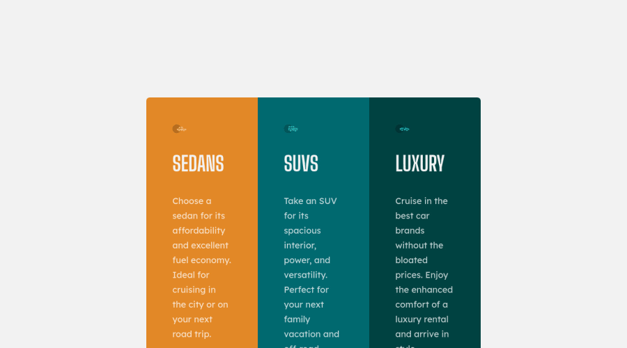
One of the biggest problems is the large margins it uses. For example,
margin: 14rem 21rem 10rem;
: 21rem is 336px of margin on one side, giving 672px of margin total.When using the DevTool, keep in mind that the screenshot was taken with a resolution of 1440px. Your screenshot has a lot of white space due to the large margin. consider using a smaller margin or remove it
Other suggestions:
- You should use only one
<h1>
tag per page. The<h1>
tag is the most important heading tag, This can confuse screen reader users and search engines. This challenge requires thatSedans
,SUVs
andLuxury
are headings, but you can use the<h2>
tag instead of the<h1>
tag. You can read more about this here.
- You should use the
<a>
tag instead of the<button>
tag because theLearn More
button is a link to another page. Use buttons to perform actions like submitting a form or closing a modal and use links to navigate to another page. You can read more about this here.
- Not all images should have alt text. Car icons are for decoration purposes only, so they can be hidden from screen-readers by adding
aria-hidden="true"
and leaving its alt attribute empty:
<img src="./images/icon-sedans.svg" alt aria-hidden="true"> <img src="./images/icon-suvs.svg" alt aria-hidden="true" > <img src="./images/icon-luxury.svg" alt aria-hidden="true" >
I hope you find it useful! π Above all, the solution you submitted is great!
Happy coding!
0@myrojoyleePosted almost 2 years ago@MelvinAguilar I have a macbook pro but have a second monitor so i can look at it closer, so maybe that is where my error is. what should i be using then to compare it to the design? or should i not do this type of comparison? i just opened the file it gave me and added the white space that i thought was there, but it ended up messing it all up. how to fix? i also maybe do not know how to implement what you said about using a smaller margin.......
0@MelvinAguilarPosted almost 2 years ago@myrojoylee If what you want is to center it, instead of using large margins, use a height defined in the body element
body { min-height: 100vh; }
Use devtool to simulate a 1440px wide screen to see what your final screenshot would look like.
0@myrojoyleePosted almost 2 years ago@MelvinAguilar I thought I used this since I even checked my margins using dev tools..........maybe I'm using it improperly? Or maybe I need a break HAHA
0@MelvinAguilarPosted almost 2 years ago@myrojoylee It has centered it horizontally, but not vertically. To center it vertically you should set a height, and the only height I see is commented:
/* height: 1500px; */
Try this:
body { background-color: var(--clr-neutral-200); display: grid; place-content: center; min-height: 100vh; /* Add the height */ /* height: 1500px; */ font-family: var(--ff-body); font-size: 1.1rem; } .cars { /* margin: 6rem 1.75rem; */ /* Remove this margin */ margin: 1.75rem; /* It is a more acceptable margin */ . . . } @media (min-width: 800px) { .cars { grid-template-columns: 1fr 1fr 1fr; /* margin: 14rem 21rem 10rem; */ /* Remove this margin*/ } }
And don't worry if there are little mistakes, you've done a great job.
0@myrojoyleePosted almost 2 years ago@MelvinAguilar oh, no i meant i thought i was using the dev tools to check what it looked like but i think i'm using dev tools improperly because i am consistently getting messed up margins lol. i haven't tried changing the height yet, i am not near my workspace to do it but will add the 100vh and delete the unnecessary lines later :D
0 - You should use only one
- @myrojoyleePosted almost 2 years ago
OK, this isn't feedback on myself, but a question. I line it up with the design it provides me but I'm always ending up super off when it loads on here. I have dev tools open and it says I'm all lined up but here it always isn't. When I open the site on my monitor it looks totally fine...Someone help lol. Thanks again :).
0@j-tomajinPosted almost 2 years ago@myrojoylee Hello :D
-
are you talking about the design? if yes, you can use Figma/adobeXD or any editing app to track the right size for paddings, margins, gaps, etc. But don't focus on getting the right sizes for everything you might stuck on it for hours(talking about my experience xD)
-
and you might want to learn CSS preprocessor now, like SASS it will make your job easier.
GOODLUCK!
0@myrojoyleePosted almost 2 years ago@AsukalDePapa i've only completed beginner and intermediate css and html and have not used sass at all yet. i have the basics down, and got used to doing the media query but it's always the margins and sizes of things that look fine on my mac but not on here, ever, lol. should this matter? my head is spinning over "margin" and "sizing" problems.
0@j-tomajinPosted almost 2 years ago@myrojoylee it matters but doesn't have to be perfect. I have a similar problem before, but it just my browser is zoomed in lol.
- it will actually help to watch some crash course where they build landing pages. This helps me a lot.
0@myrojoyleePosted almost 2 years ago@AsukalDePapa Is there one you recommend me to watch first ? I need all the help :D
0@j-tomajinPosted almost 2 years ago@myrojoylee this the first video I've watched By DesignCourse this is where I learned about the responsive navigation.
0 -
Please log in to post a comment
Log in with GitHubJoin our Discord community
Join thousands of Frontend Mentor community members taking the challenges, sharing resources, helping each other, and chatting about all things front-end!
Join our Discord