Design comparison
Community feedback
- @malek-btPosted almost 2 years ago
Hey !, how are you ? I really liked the result of your project, but I have some tips that I think you will enjoy:
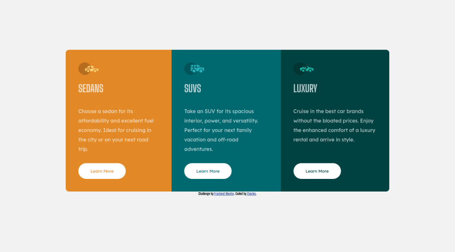
*Move the class container to the <main> tag to fix the accessibility issue.
*Replace the <div > tag width <section > and <article> and remove the attribution class from <div> and make it in the <footer>for semantic page.You can read more about semantic here: HTML Semantic Elements.
*The <img> alt attribute is used to specify the alternate text for an image. It is useful when the image is not displayed. It is used to give alternative information for an image.So make sure to make it .
*Use <footer> instead of <div class="attribution">. The <footer> element contains authorship information. Once you update the container <div class="attribution">, the footer should be outside the main content.
*Instead of using pixels in font size, use relative units of measure like rem or em. The font size in absolute length units (px) does not allow users with limited vision to change the text size in some browsers.
The rest is good, I hope those tips will help you! 👍
0
Please log in to post a comment
Log in with GitHubJoin our Discord community
Join thousands of Frontend Mentor community members taking the challenges, sharing resources, helping each other, and chatting about all things front-end!
Join our Discord
