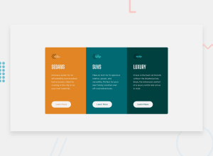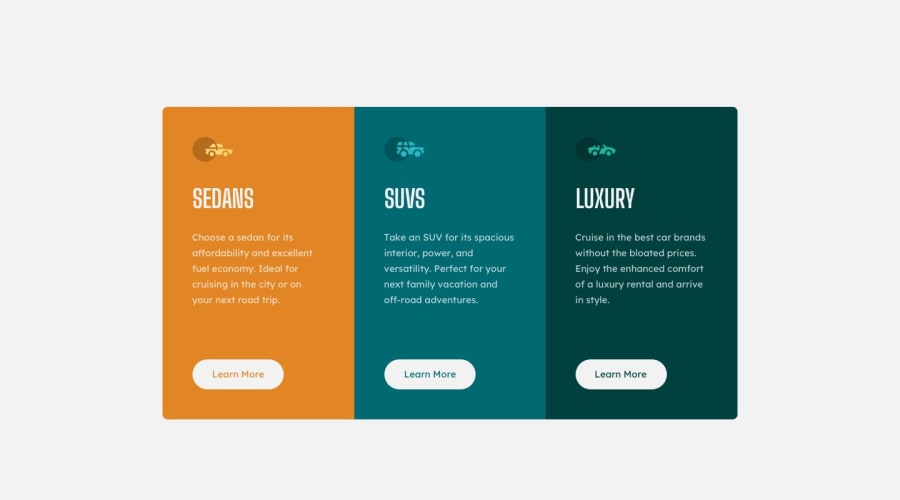
Design comparison
Community feedback
- @RioCantrePosted over 2 years ago
Hello there! Good job in completing this challenge. Regarding your solution, I would like you to notice the following…
- Well done in placing description in your code
- The HTML is well structured and organized with proper usage of semantic tags. You could wrap this line
<div class="attribution">withmaintag - The code is neat and readable
- Great job in using Sass. The components are well organized. Specially the variables where you put all the necessary details like font, colors, and layout
- The Sass files are well describe with descriptions on important part
- Well done with the responsive design, though the transitions is too early, it can be adjust by decreasing the breakpoints
- The project is well detailed based on the given design
Above all, the project is done well. Keep up the good work! Cheers!
Marked as helpful0@tea-scriptsPosted over 2 years ago@RioCantre Thank you for the insight.
- I actually aimed to have the
<div class="attribution">inside of themainI didn't pay attention to move themainto the</body>but I'll adjust that right away. - I used the breakpoints given in the requirements so I'm not quite sure if I should be adjusting that or what do you think?
0@RioCantrePosted over 2 years ago@coder-teamie In real life scenarios, Responsive design must contain between desktop, tablet and mobile view. It's best practice to include those while your learning.
0@tea-scriptsPosted over 2 years ago@RioCantre Of course I always included the desktop, tablet and mobile view when developing my projects I just didn't see the need to split the one-column into two in the tablet view but I fixed that already. Once again, thank you 😊
0 - @denieldenPosted over 2 years ago
Hi Teamie, I took some time to look at your solution and you did a great job!
Tip of graphic design: With
font-family:" Big Shoulders Display ", cursivethe browser will use the Comics Sans font when it doesn't find the first font indicated (you can seen during loading) ... for the designer it's a really awful font!- I would rather replace it with a
font-family:" Big Shoulders Display ", sans-serifmuch more similar to the primary font.
Overall you did well :)
Hope this help and happy coding!
Marked as helpful0@tea-scriptsPosted over 2 years ago@denielden Thanks mate. I'll look into that right away
1 - I would rather replace it with a
Please log in to post a comment
Log in with GitHubJoin our Discord community
Join thousands of Frontend Mentor community members taking the challenges, sharing resources, helping each other, and chatting about all things front-end!
Join our Discord
