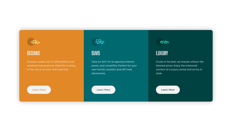


Design comparison
SolutionDesign

Solution retrospective
It's a fun challenge to work on and improve the layout skills. any feedback and suggestions will be greatly appreciated.
Community feedback
- @danielmrz-devPosted 9 months ago
Hello @Chandrakhd!
Your solution looks great!
I have one minor suggestion:
📌 Consider adding a
max-widthto the card, so it won't overgrow and fill the whole viewport width. By doing that, it'll remain responsive, but it'lll grow only until a certain point.Here's how you can do it:
.card_container {
    height: 98vh;
    display: flex;
    justify-content: center;
    align-items: center;
    margin: auto;
    max-width: 900px;
}
I hope it helps!
Other than that, you did an excellent job!
Marked as helpful0

Please log in to post a comment
Log in with GitHub
Join our Discord community
Join thousands of Frontend Mentor community members taking the challenges, sharing resources, helping each other, and chatting about all things front-end!
Join our Discord