

Design comparison

Solution retrospective
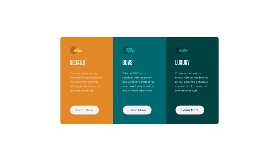
3-Column Preview Card Component:
I really enjoyed working on this project, it felt like the first time that things that I've been learning were starting to click. Theres still a long road ahead for my web dev journey but I will take the success of this project as a personal victory!
Wins:
- Made use of a professional styling reset at the start of my styles.css file.
- Able to solve problems using already existing documentation as I ran into them.
- Felt really comfortable with applying basic flex-box styling to the elements.
Go Gets:
- Try and find a simpler solution for handling element color changes. Felt like my CSS was not as optimized as it could have been.
- Choose a challenge that requires the use of a CSS grid to force learning.
- Try a harder HTML / CSS challenge (non-newbie)
One of the problems I ran into was on the hover states, the blocks would get pushed down. After some googling, I realized that the problem was caused by not having a border on the initial button state. Putting a border (albeit invisible) on the learn more buttons solved this issue!
Questions that I had while working on this project:
- Will I run into specificity issues with having the h1 override the body font?
- Is there a way to have the button color inherit the same color as the background or is the best way to separate it separately?
- Is there a simpler solution for handling the button hover state changes?
Any additional feedback would be greatly appreciated!
Community feedback
Please log in to post a comment
Log in with GitHubJoin our Discord community
Join thousands of Frontend Mentor community members taking the challenges, sharing resources, helping each other, and chatting about all things front-end!
Join our Discord