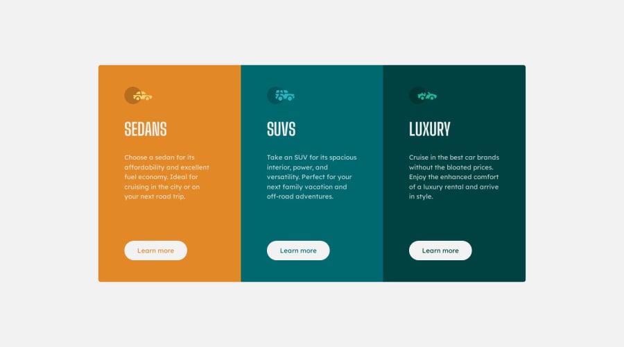


Design comparison

Solution retrospective
All suggestions and hints are welcome. Thank you. :)
Please log in to post a comment
Log in with GitHubCommunity feedback
- @0xabdulkhaliq
Hello there 👋. Congratulations on successfully completing the challenge! 🎉
- I have other recommendations regarding your code that I believe will be of great interest to you.
DECORATIVE SVG'S ♨️:
- The
altattribute is used to provide alternative text for images in HTML documents. Thealtattribute is used by screen readers to describe the image to visually impaired users, which is essential for web accessibility.
- Now, when it comes to decorative
SVGs, they are used purely for aesthetic purposes and do not convey any important information or functionality to the user.
- Since these images do not convey any important information or functionality, there is no need for an
altattribute.
- So feel free to set the
altattribute as""for decorativesvg's, becausealt=""will be skipped by screen readers they will consider the image as decoration
Example:
<img src="images/decorative.svg" alt=""><img src="images/icon-luxury.svg" alt="Luxury-icon"> 👇 <img src="images/icon-luxury.svg" alt="">
.
I hope you find this helpful 😄 Above all, the solution you submitted is great !
Happy coding!
Marked as helpful - Account deleted
Hey there! 👋 Here are some recommendations for enhancing your code:
- The “car icons” in this component are purely decorative⚠️. Their
alt tagshould be left blank to remove them from assistive technology.
More Info:📚
https://www.w3.org/WAI/tutorials/images/
- The headings in your component are being used incorrectly❌. Since the
h1heading can only be used once ⚠️, it is always given to the heading with the highest level of importance. This component has three headings of equal importance, so the best option would be to use anh2heading ✅ since it is reusable and it will give each heading the same level of importance.
- For improved accessibility 📈 for your content, it is best practice ✅ to use
remfor yourfont-sizeand other property values. Whileemis best formedia-queries. Using these units gives users the ability to scale elements up and down, relative to a set value.
- ALWAYS Implement a "Mobile First" approach 📱 > 🖥
Mobile devices are now the dominant 👑 way in which people browse the web. So when building your content, you will start building with small screen sizes (starting at 320px) and work your way to larger screens using
min-width.More Info: 📚
If you have any questions or need further clarification, feel free to reach out to me.
Happy Coding! 👾
Marked as helpful - The “car icons” in this component are purely decorative⚠️. Their
- @Nix7amcm
Hey @Ola135! 😊
Excellent job with this challenge! 😃
I have just a couple tips that might be helpful!
First, you might consider setting your breakpoint to something around
920px, switching to column a little earlier to prevent the box width becoming too small as the screen size narrows.Then, within your query, to prevent the boxes then being too wide, you could set a
max-widthto your.cardelement, maybe something around500px. You could play around with this to see what you like best!I hope this helps! Great work! 🚀😃👍🏻
Marked as helpful


Join our Discord community
Join thousands of Frontend Mentor community members taking the challenges, sharing resources, helping each other, and chatting about all things front-end!
Join our Discord