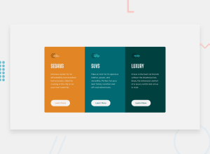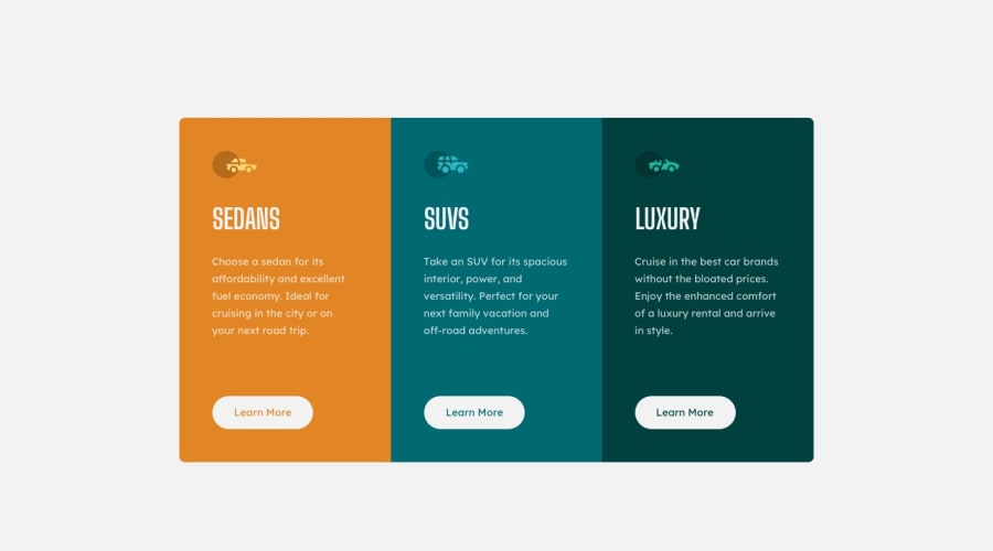
Design comparison
SolutionDesign
Solution retrospective
I feel like I did my best on this challenge. But your feedback is always awaited and appreciated.
Community feedback
- @hardy333Posted about 3 years ago
Hey, nice job, card looks good.
Few suggestions:
- use cursor:pointer; on buttons.
- use border: 1px solid transparent; on buttons this prevents content shift when hovering them.
Good luck ...
Marked as helpful3 - @muhammadshajjarPosted about 3 years ago
Hey, great work on this one,
- The Learn more should be
alink, in my opinion, using theatag and not a button. Use thebuttonif it will act as a control for something. But on this, it is treated as a link, go foratag. - For any decorative images, like in this case the icons in your cards , you should leave the
alt=""and addaria-hidden=" true"orrole=" presentation"to make sure that all screen readers will ignore those icons. - Use only one
h1per page. Don't judge heading level by the weight of text given in design - Instead of going for
widthtry to go formax-width. Writing fixed things would cause issues. - To overcome your accessibility issue you should need to add some semantic markers to designate sections of the page as the header, navigation, main and footer e.g:
<main>
     <div></div>
  </main>
  <footer>
</footer>
Thanks, hope it would help!
Marked as helpful1@esthercatePosted about 3 years ago@muhammadshajjar Thank you. This is very insightful
0 - The Learn more should be
Please log in to post a comment
Log in with GitHubJoin our Discord community
Join thousands of Frontend Mentor community members taking the challenges, sharing resources, helping each other, and chatting about all things front-end!
Join our Discord
