Design comparison
SolutionDesign
Solution retrospective
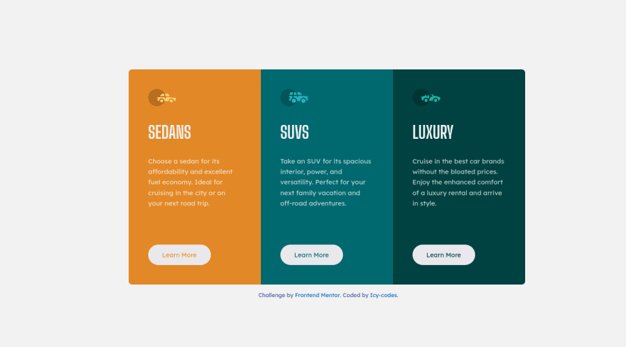
I'm still having some issues with centering the main component card perfectly. Please I'll appreciate the community's feedback on this project.
Thank you.
Community feedback
- @kartardeveloperPosted about 2 years ago
Hey Canice, You did great! Some things that you can improve -- 1). Add a transition on button so that the animation looks smooth. 2). You can replace font-size with transform: scale(1.2); on button hover. The other looks good! Hope this will help you. 👍
0
Please log in to post a comment
Log in with GitHubJoin our Discord community
Join thousands of Frontend Mentor community members taking the challenges, sharing resources, helping each other, and chatting about all things front-end!
Join our Discord
