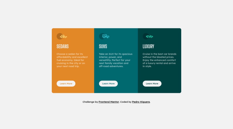
3-column preview card component
Design comparison
Solution retrospective
All suggestions are welcome
Community feedback
- @mmenghnaniPosted over 3 years ago
Hi Pedro, this looks really great. Just a few nitpicks I noted,
-
The height changes when you hover over the buttons. I don't think that is intended behavior. You can just use the suggestion that patrick shared above!
-
Is there any specific reason why we can't directly use button tag in the stylesheet instead of creating a new button class
-
Also, small typo - all three images tags have the same alt text :)
Great work, :clapping
Marked as helpful1@PedroHigueraGPosted over 3 years ago@mmenghnani Thanks for your comment!, I'll correct the code and improved it. :3
0 -
- @palgrammingPosted over 3 years ago
move this
order: 0.1rem solid var(--very-light-gray);from your button hover to just the button this way when you hover the button your card does not change heightMarked as helpful1@PedroHigueraGPosted over 3 years ago@palgramming Thank you for the solution to the hover problem!, I'll edit the code of my CSS file.
0
Please log in to post a comment
Log in with GitHubJoin our Discord community
Join thousands of Frontend Mentor community members taking the challenges, sharing resources, helping each other, and chatting about all things front-end!
Join our Discord
