Submitted almost 2 years ago
HTML5 | CSS | Mobile First | CSS Custom Properties | Flexbox
@Hazel-Black
Design comparison
SolutionDesign
Solution retrospective
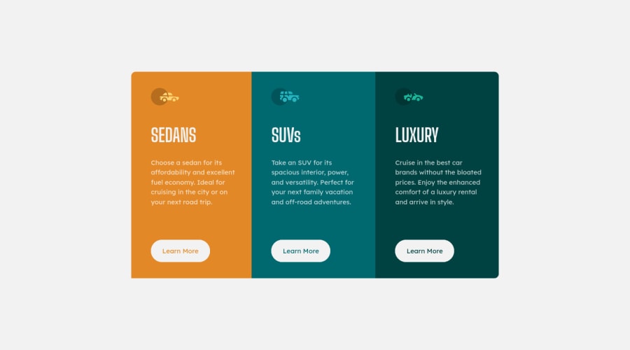
Started this project months ago. I realized this morning I never submitted it so I decided to solve some of the issues I had with the css and submit it. Any and all Suggestions for improvements are welcome. 🤗
Community feedback
- @VCaramesPosted almost 2 years ago
Hey there! 👋 Here are some suggestions to help improve your code:
- The “car icons” in this component are purely decorative. ⚠️ Their
alt tagshould be left blank and have anaria-hidden=“true”to hide them from assistive technology.
More Info:📚
https://www.w3.org/WAI/tutorials/images/
- Your "buttons" were created with the incorrect element ❌. When the user clicks on the button they should be directed to a different part of you site. The
anchor tag}will achieve this.
More Info:📚
- Your
CSS Resetis being underutilized. 😢 To fully maximize 📈 it, you will want to add more to it.
Here are some examples that you can freely use:
- For improved accessibility 📈 for your content, it is best practice to use
remfor yourfont-sizeand other property value. Whileemis best formedia-queries. Using these units gives users the ability to scale elements up and down, relative to a set value.
If you have any questions or need further clarification, feel free to reach out to me.
Happy Coding!🎄🎁
0 - The “car icons” in this component are purely decorative. ⚠️ Their
Please log in to post a comment
Log in with GitHubJoin our Discord community
Join thousands of Frontend Mentor community members taking the challenges, sharing resources, helping each other, and chatting about all things front-end!
Join our Discord
