Design comparison
SolutionDesign
Solution retrospective
This is my first challenge. No questions from my side and please share the feedback on my code. Thanks...
Please log in to post a comment
Log in with GitHubCommunity feedback
- @mv805
Hello and good job. A couple of observations-
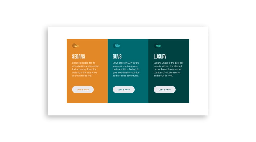
- The buttons should invert colors when hovered over, not drop a shadow. See the reference pictures for an example.
- The outside corners should have radii. This means that they will switch locations when you transition from mobile to desktop.
Marked as helpful
Join our Discord community
Join thousands of Frontend Mentor community members taking the challenges, sharing resources, helping each other, and chatting about all things front-end!
Join our Discord
