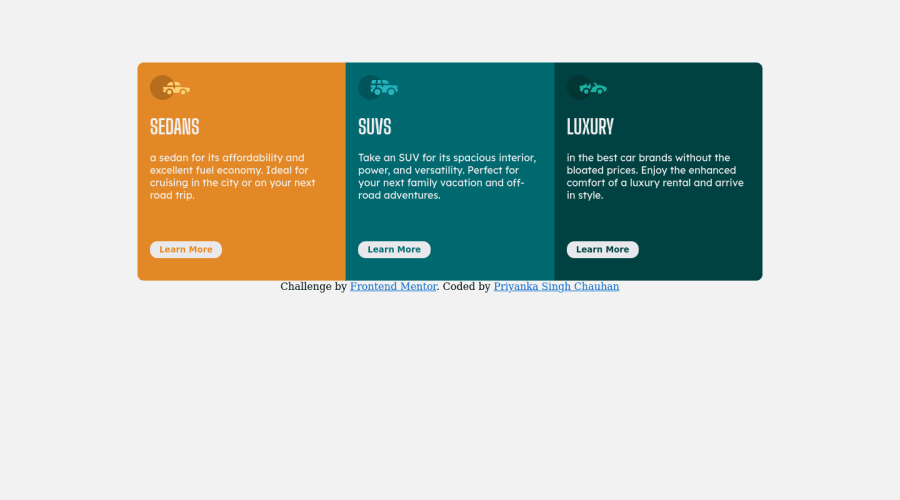
Design comparison
Solution retrospective
Feedbacks are welcome.
Community feedback
- Account deleted
Hey there! 👋 Here are some suggestions to help improve your code:
- Do not forget ⚠️ to check your FEM report (It provides value information), to see what is incorrect and update your code with it. This should be done immediately after submitting your challenge.
- The
headerandarticleelement is being used incorrectly ⚠️ and not needed for this challenge .
- Do not capitalize❌ "sedans", "suvs" and "luxury" in HTML as it is not accessible friendly. Instead you will want to style it in CSS.
- Your
CSS Resetis being underutilized. 😢 To fully maximize 💯 it, you will want to add more to it. Here are some examples that you can freely use 😁: Josh Comeau Reset Eric Meyer Reset
- For improved accessibility 📈 for your content, it is best practice ✅ to use
remfor yourfont-sizeand other property values. Whileemis best formedia-queries. Using these units gives users the ability to scale elements up and down, relative to a set value.
- To properly center ✅ your content to your page, you will want to add the following to your
body(this method uses CSS Grid):
body {
    min-height: 100vh;
    display: grid;
    place-content: center;
}
More Info: 📚
If you have any questions or need further clarification, feel free to reach out to me.
Happy Coding! 🎆🎊🪅
Marked as helpful0 - @MelvinAguilarPosted over 2 years ago
Hello there 👋. Good job on completing the challenge !
I have some suggestions about your code that might interest you.
HTML 📄:
- Use the
<main>tag to wrap all the main content of the page instead of the<div>tag. With this semantic element you can improve the accessibility of your page.
- The <article> tag is not necessary, you can use a paragraph instead
- You should use only one
<h1>tag per page. The<h1>tag is the most important heading tag, This can confuse screen reader users and search engines. This challenge requires thatSedans,SUVsandLuxuryare headings, but you can use the<h2>tag instead of the<h1>tag. You can read more about this here 📘.
- You should use the
<a>tag instead of the<button>tag because theLearn Morebutton is a link to another page. Use buttons to perform actions like submitting a form or closing a modal and use links to navigate to another page. You can read more about this here 📘.
I hope you find it useful! 😄 Above all, the solution you submitted is great!
Happy coding!
Marked as helpful0@Pri89yankaPosted over 2 years ago@MelvinAguilar Thanks for suggestions. How can I use landmarks in every element?
0 - Use the
Please log in to post a comment
Log in with GitHubJoin our Discord community
Join thousands of Frontend Mentor community members taking the challenges, sharing resources, helping each other, and chatting about all things front-end!
Join our Discord
