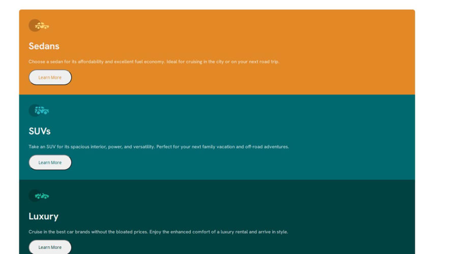
Design comparison
Solution retrospective
Not sure if the buttons are correct it has a outline around it not sure how to get rid of the outline?
Community feedback
- @danielmrz-devPosted 9 months ago
Hello @mverma45!
Your solution looks great!
I have a couple of suggestions (about semantic HTML) for improvement:
📌 First: Use
<main>to wrap the main content instead of<div>.Think of
<div>and<span>in HTML like plain boxes or placeholders. They're handy for holding content, but they don't tell us anything about what's inside or what it's meant for on the webpage.📌 Second: Only use one
<h1>per page - this should represent the main heading/title for the whole page. This project is not very obvious about what's the main title. In those cases, we use a hidden<h1>and use<h2>for the 3 others.Unlike what most people think, it's not just about the size and weight of the text.
- The
<h1>to<h6>tags are used to define HTML headings. <h1>defines the most important heading.<h6>defines the least important heading.- And don't skip heading levels - start with
<h1>, then use<h2>, and so on.
All these tag changes may have little or any visual impact but they make your HTML code more semantic and improve SEO optimization as well as the accessibility of your project.
I hope it helps!
Other than that, great job!
Marked as helpful1@mverma45Posted 9 months ago@danielmrz-dev I didn't realize I had multiple <h1> tags, so since I want all the titles to be the same size. Could I create a class and just style the class to be like an <h1> ?
1@danielmrz-devPosted 9 months ago@mverma45
The size of the title does not matter because you can change it with CSS. You can make a
<h1>look like a<h6>or vice-versa.So yes, you can create a class to make them look like you want 😊
Marked as helpful1@mverma45Posted 9 months ago@danielmrz-dev thank you for your suggestions. I just refactored the code.
1@mverma45Posted 9 months ago@danielmrz-dev I watch a YT video in the video it said px aren't used very much, it said to use em, rem's.
1@mverma45Posted 9 months ago@danielmrz-dev I just followed you on all your social media you have on your profile
1 - The
- @CarlHummPosted 9 months ago
Hi there
To remove the outline around the buttons you can type
border: 0orborder: none. The border is set by default by the browser. You can see this yourself if you open up dev tools (F12), highlight the button element, and then scroll down the styles panel until you see the styles for 'user agent stylesheet'.I would also recommend re-thinking and removing the
min-width: 220vh. You're setting the width of your container to more than twice the height of the screen, which on desktop is a lot and causes it to overflow horizontally. I see you've used similar units in other places too, including media queries. This is not common or best practice as you're attempting to control the width/horizontal resolution using a vertical unit (viewport height). A much more common approach is to use pixels, rems and ems. Viewport units have their place but I don't think they are necessary here.Other than this, good job. Feel free to ask me any questions and good luck on your next project!
Marked as helpful1@mverma45Posted 9 months ago@CarlHumm Thanks, I fixed the the vh issue I used rems and ems, I tried using px but I watch a YT video in the video it said px aren't used very much anymore. but let me know what you think.
0
Please log in to post a comment
Log in with GitHubJoin our Discord community
Join thousands of Frontend Mentor community members taking the challenges, sharing resources, helping each other, and chatting about all things front-end!
Join our Discord
