Design comparison
SolutionDesign
Solution retrospective
Hello, everyone!
This is my solution for the above mentioned project.
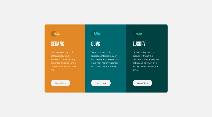
Even though 3 h1s seem weird to me, the accessibility report doesn't have a problem with it. I initially used a hidden h1, but I still got the same notification from the report.
In a video on SEO by a Google employee I stumbled across, he said that you can use as many h1s as you'd like, because it doesn't really matter.
What would you think is the best way to define the headings in this case, where there is no clear h1?
Thanks and happy coding!
Community feedback
Please log in to post a comment
Log in with GitHubJoin our Discord community
Join thousands of Frontend Mentor community members taking the challenges, sharing resources, helping each other, and chatting about all things front-end!
Join our Discord
