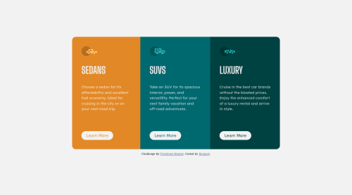
Submitted almost 3 years agoA solution to the 3-column preview card component challenge
Responsive Three Column Preview Card Component
@CryptoFallen

Solution retrospective
I have an issue with the button the whole div expands vertically when hovering over the button, what is the best way to counteract that?
Other than the issue listed above, I had a great time building this static project. I have a lot of work still to do with learning the responsive layout.
Code
Loading...
Please log in to post a comment
Log in with GitHubCommunity feedback
No feedback yet. Be the first to give feedback on Richard Tom's solution.
Join our Discord community
Join thousands of Frontend Mentor community members taking the challenges, sharing resources, helping each other, and chatting about all things front-end!
Join our Discord