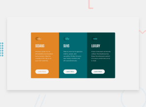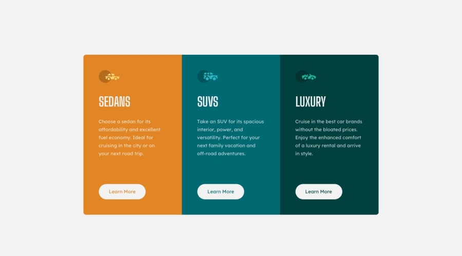
Design comparison
Solution retrospective
Any feedback is welcome ;)
Please log in to post a comment
Log in with GitHubCommunity feedback
- @correlucas
👾Hello Yunus Emre, congratulations for your new solution!
To keep your solution as closer as possible from the design reference you can try a Google Chrome extension called
pixel perfect. Or use the exact sizes for the container, for example using the correct padding and the container size likemax-width: 1110px.When you download the project files there’s a file called
style-guide.mdwhere you can find information such ashsl color codesand thefont-sizefor the headings.This will makes you gets closer to have your design similar to the challenge.👋 I hope this helps you and happy coding!
Marked as helpful - @denielden
Hi Yunus, congratulations on completing the challenge, great job! 😁
Some little tips for optimizing your code:
- add
maintag and wrap the card for improve the Accessibility - in this case it would be better to use an
aelement for the buttons because that would probably be a link... but that's okay too - add
transitionon the element with hover effect - instead of using
pxuse relative units of measurement likerem-> read here - in the small screen like a mobile add
padding: 1remto the body and setwidth: 100%to.first, .second and .thirdclasses - remove
border-radiusfrom.first and .thirdclasses and addborder-radius: .5rem and overflow: hidden;tocontainerclass... it is a much better and less difficult approach to manage
Hope this help! Happy coding 😉
- add
- @yunusemrecinar
My screen is larger than 1440px so component seems too close according to solution. Also I change the background color for your information
Join our Discord community
Join thousands of Frontend Mentor community members taking the challenges, sharing resources, helping each other, and chatting about all things front-end!
Join our Discord
