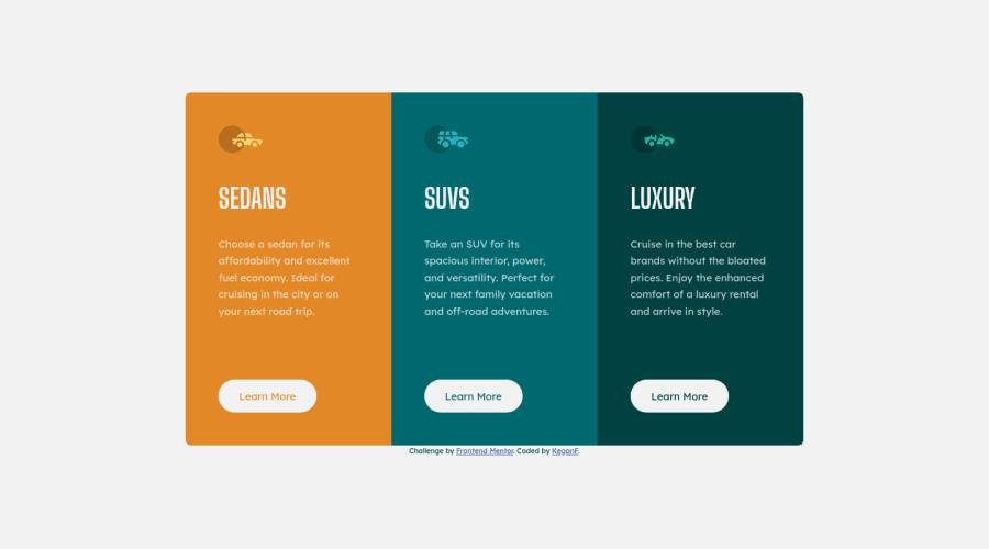
Design comparison
SolutionDesign
Solution retrospective
Hello Everybody 👋
As always, any feedback is much appreciated!
Specific feedback I would love to hear:
-
Some numbers are hardcoded to try and match the design as close as possible. Is the use of things like
.button { margin-top: 4rem; }appropriate? Or are there better ways to approach the layout of the card to avoid things like this? -
What are the best use cases for flexbox? Would flexbox be better for the layout of the cards in this specific project?
-
Could I have made better use of
@mediafor layout control? Any general tips for best practice use of@media?
Cheers! 😊
Community feedback
Please log in to post a comment
Log in with GitHubJoin our Discord community
Join thousands of Frontend Mentor community members taking the challenges, sharing resources, helping each other, and chatting about all things front-end!
Join our Discord
