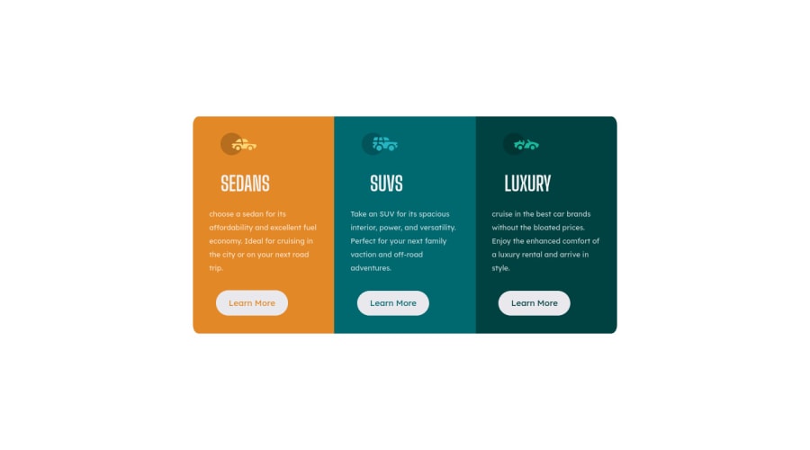
Design comparison
SolutionDesign
Community feedback
- @Mitko90Posted over 1 year ago
Hi, nice solution.
It looks great.
Maybe you can check some suggestions I have for you:
- You used three times the
<h1>heading. This heading should only be used once. Maybe change it to<h2>as it can be reused. Of course every page should have anh1heading so I suggest adding avisually-hiddenone to the page, so it doesn't generate an accessibility report. - Your buttons should direct the user to a different part or page of the site. So maybe switch the
<button>with the<a>tag.
I had the exact same mistakes when I did this challenge so I redid it with the changes. You can, if you want, check both of my submissions here and here.
Above all the solution you submitted looks great.
Happy coding.
0@kxtaraPosted over 1 year ago@Mitko90 Hi, thanks for the suggestions I’ll be making those changes soon.
0 - You used three times the
Please log in to post a comment
Log in with GitHubJoin our Discord community
Join thousands of Frontend Mentor community members taking the challenges, sharing resources, helping each other, and chatting about all things front-end!
Join our Discord
