Submitted over 3 years ago
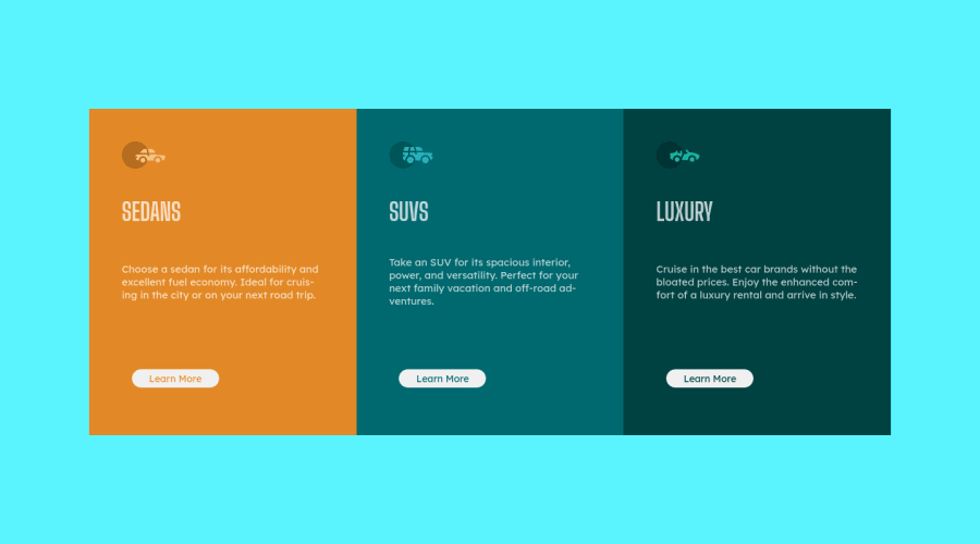
3-column preview card built using HTML5, CSS3 with a CSS Grid layout
@TXMack713
Design comparison
SolutionDesign
Solution retrospective
I completed this using StackBlitz and worked to refine it throughout the day. However, checking it later on my personal laptop I noticed that the text overlapped quite heavily. I haven't checked yet, but I wondered if it may have been due to my OS default setup (new Ubuntu user here). If anyone is seeing any crazy overlap, I would very much appreciate you letting me know.
Community feedback
- @NebiyouErsaboPosted over 3 years ago
Hey there, To accurately copy the design I suggest you do these:
- fix the background color as specified on the style template
- adjust the size and hover states of buttons (the buttons in mobile and desktop look different in size and shape)
- adjust the font-family/weight of the titles
- adjust line heights of the paragraphs
- and also work a bit more on the responsiveness of the website (while changing to the mobile layouts, the card fills the screen, so fix that with some margins).
I hope it gave out some pointers! Good luck!👍
0
Please log in to post a comment
Log in with GitHubJoin our Discord community
Join thousands of Frontend Mentor community members taking the challenges, sharing resources, helping each other, and chatting about all things front-end!
Join our Discord
