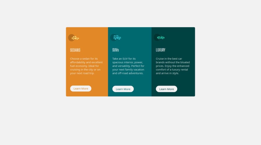
Design comparison
Solution retrospective
This is my first attempt at making a responsive component. Any feedback of anything i could have done better will be greatly appreciated.
Community feedback
- @Ezekiel225Posted 9 months ago
Hello there 👋 @KierenLWoods.
Good job on completing the challenge !
Your project looks really good!
I have a suggestion about your code that might interest you.
There is an very useful browser extension called Perfect Pixel that allow you compare with the design image and thus see the exact dimensions. I recommend it to you.
Consider adding a min-height of 100vh to the body element so as to centralize your project.
body {
  min-height: 100vh;
  align-items: center;
  display: flex;
  justify-content: center;
}
I hope this suggestion is useful for future projects.
Keep up the excellent work and continue to challenge yourself with new projects. Your progress is impressive, and each project is a step forward in your front-end development journey! 🚀🌟.
Other than that, great job!
Happy coding.
Marked as helpful0 - @danielmrz-devPosted 9 months ago
Hello @KierenLWoods!
Your project looks great!
I have one suggestion for you to improve it even more:
- Using
paddingis not the best option to center an element. Here's a very efficient (and better) way to place an element in the middle of the page both vertically and horizontally:
📌 Apply this to the body (in order to work properly, don't use position or margins):
body {
    min-height: 100vh;
    display: flex;  /* it works with grid too  */
    justify-content: center;
    align-items: center;
}
I hope it helps!
Other than that, great job!
0 - Using
Please log in to post a comment
Log in with GitHubJoin our Discord community
Join thousands of Frontend Mentor community members taking the challenges, sharing resources, helping each other, and chatting about all things front-end!
Join our Discord
