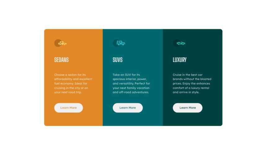
Design comparison
SolutionDesign
Solution retrospective
This project was challenging to me which I enjoyed. I do have two questions that I would like to have feedback on.
- When it comes to the spacing between the information in the sections, I wanted to ask what I could have done differently.
- When creating the mobile design, I struggled to make it appear like in the image provided, I also would like to have feedback on that.
Please log in to post a comment
Log in with GitHubCommunity feedback
No feedback yet. Be the first to give feedback on Fidel A Hernandez Jr's solution.
Join our Discord community
Join thousands of Frontend Mentor community members taking the challenges, sharing resources, helping each other, and chatting about all things front-end!
Join our Discord
