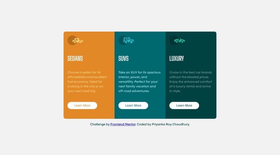
Design comparison
Solution retrospective
Hi everyone!
I have just completed my 3 column card project.
Any feedback is appreciated!
Thank you
Priyanka
Community feedback
- @MelvinAguilarPosted 12 months ago
Hello there 👋. Good job on completing the challenge !
I have othersuggestions about your code that might interest you.
- You should use a CSS reset. A CSS reset is a set of CSS rules that are applied to a webpage in order to remove the default styling of different browsers.
- You should use the
<a>tag instead of the<button>tag because theLearn Morebutton is a link to another page. Use buttons to perform actions like submitting a form or closing a modal and use links to navigate to another page. You can read more about this here 📘.
- Not all images should have alt text. Car icons are for decoration purposes only, so they can be hidden from screen-readers by leaving its alt attribute empty. You can read more about this here 📘.
I hope you find it useful! 😄 Above all, the solution you submitted is great!
Happy coding!
Marked as helpful0 - @danielmrz-devPosted 12 months ago
Hello @PriyankaRC16
Your project looks great!
You just need the check again the cards
border-radiusin the mobile version. They have the same borders from the desktop version, but since the mobile version is organized as a column, theborder-radiusare on the wrong corners.Other than this little detail, you did a great job!
Marked as helpful0@PriyankaRC16Posted 12 months ago@danielmrz-dev Good catch! Thanks a lot for this feedback! I have just fixed it!
1
Please log in to post a comment
Log in with GitHubJoin our Discord community
Join thousands of Frontend Mentor community members taking the challenges, sharing resources, helping each other, and chatting about all things front-end!
Join our Discord
