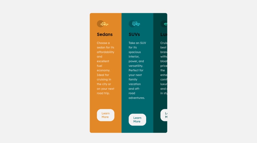
Design comparison
Solution retrospective
When I run the code on my pc it works perfectly fine and the card is centered but when I run the github link it's not centered anymore. Anybody know what's going on?
Community feedback
- @MelvinAguilarPosted almost 2 years ago
Hello again 👋. Good job on completing the challenge !
I have some suggestions about your code that might interest you.
CSS 🎨:
- To center it, you just need to add
justify-content: center.
HTML 📄:
- You should use only one
<h1>tag per page. The<h1>tag is the most important heading tag, This can confuse screen reader users and search engines. This challenge requires thatSedans,SUVsandLuxuryare headings, but you can use the<h2>tag instead of the<h1>tag. You can read more about this here 📘.
I hope you find it useful! 😄 Above all, the solution you submitted is great!
Happy coding!
Marked as helpful2@idaomoumiPosted almost 2 years ago@MelvinAguilar Hi again! Thank you I'll make the changes immediately!
0 - To center it, you just need to add
- @HassiaiPosted almost 2 years ago
to center .container on the page using flexbox, add justify-content: center to the body and remove margin: 0 auto from .container.
To center .container on the page using flexbox:
body{
min-height: 100vh;
display: flex;
align-items: center;
justify-content: center;
}
Use relative units like rem or em as unit for the padding, margin, width values and preferably rem for the font-size values, instead of using px which is an absolute unit. For more on CSS units Click here
Hope am helpful.
Well done for completing this challenge. HAPPY CODING
Marked as helpful1
Please log in to post a comment
Log in with GitHubJoin our Discord community
Join thousands of Frontend Mentor community members taking the challenges, sharing resources, helping each other, and chatting about all things front-end!
Join our Discord
