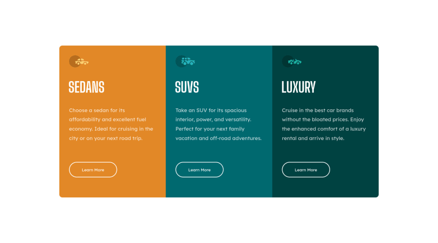
Not Found
Not Found
Not Found
Not Found
Not Found
Not Found
Not Found
Not Found
Not Found
Not Found
Not Found
Not Found
Not Found
Not Found
Not Found
Not Found
Not Found
Not Found
Not Found
Not Found

Submitted

3-column card preview

P

@CSE-Kyle

Desktop design screenshot for the 3-column preview card component coding challenge

This is a solution for...

  • HTML
  • CSS
1newbie
View challenge

Design comparison


SolutionDesign

Solution retrospective


hello, here's my project for the 3-column card preview. I had some struggles when approaching this challenge so I'll go ahead and do so based on the questions asked :

1.) What did you find difficult while building the project?

A: I had a difficult time taking the 3-cards and centering them exactly in the middle of the page. I was using flexbox/grid like I should when positioning the elements but I wasn't sure which one to use.

2.) Which areas of your code are you unsure of?

A: I'd say in my html I'm unsure of including a "container" div if that was necessary. I include it by default but I don't know if I actually needed it, but I kept it there just in case. Also when using flexbox/grid to position the elements exactly in the center.

3.) Do you have any questions about best practices?

A: What would be a good practice to set up my code to better have the css positioning to work efficiently? it's likely the one major issue out of the many that I have, is when I'm positioning certain elements on a website.

Please feel free to look over my code and provide me with any advice that I can use to better improve this project, thanks.

Community feedback

Vanza Setia 27,795

@vanzasetia

Posted

Hey, Kyle! 👋

Congratulations on completing your first Frontend Mentor challenge! 🎉

Here are some suggestions for improvements.

  • I recommend using the body element as the flex or grid container. You can use either flexbox or grid. For shorter code, you can use grid with place-items: center. Also, there's no need for .container div.
  • Wrap all the card elements with a landmark element, main element.
  • Use the main as the flex container of the card.
  • For the card, there's no need for .content div. Just, wrap the card with div.
<main>
  <div class="card"></div>
  <div class="card"></div>
  <div class="card"></div>
</main>
  • Swap all the h1 with h2. It is not a best practice to have many h1 on a page. It can confuse the screenreader users because there will be many titles for a single page. I recommend reading the "How-to: Accessible heading structure - The A11Y Project" article to learn how to use headings correctly.
  • Not every image needs alt text. If the image does not provide any meaningful content, in this case the car icons, consider using empty alt text (alt=””). This saves your screen reader users time as they navigate the page.
  • I recommend taking a look at "Quick tip: Using alt text properly - The A11Y Project".
  • Always specify the type of the button. It will prevent the button from behaving unexpectedly.

I have three recommended videos. The first one tells how hard HTML is (HTML is not easy). The other two talk about modern CSS techniques and approaches.

That's it! I hope my feedback answers all your questions! Happy coding!

1

P

@CSE-Kyle

Posted

@vanzasetia thank you for the help!

0
Vanza Setia 27,795

@vanzasetia

Posted

@CSE-Kyle You are welcome!

0

@al-ameen36

Posted

Hello Kyle

  1. I personally use flexbox to align/position items horizontally/vertically, while grids for making more complex layouts.

  2. For flexbox you just need a parent container and some child elements. You can do something like this. For Html

// use HTML semantic elements
<body>
  <main>
    <section class="container">
      <article class="box">...</article>
      <article class="box">...</article>
      <article class="box">...</article>
    </section>
  </main>
</body>

For CSS

.container{
     display: flex;
     align-items: center; // centers items vertically
     justify-content: center; // centers items horizontally
     height: 100vh;
}
.box{
     width: 300px; //set a fixed width for the boxes or use flex-basis property
 }

hope this helps.

0

Vanza Setia 27,795

@vanzasetia

Posted

@Ameen36

Hi, Muhammad! 👋

I recommend setting flex-basis: 100% to each .box (or card). This will automatically make the card has the same width. Also, when using flexbox, it is recommended to use flex-basis property instead of width.

1
P

@CSE-Kyle

Posted

@Ameen36 appreciate the help!

0

Please log in to post a comment

Log in with GitHub
Discord logo

Join our Discord community

Join thousands of Frontend Mentor community members taking the challenges, sharing resources, helping each other, and chatting about all things front-end!

Join our Discord