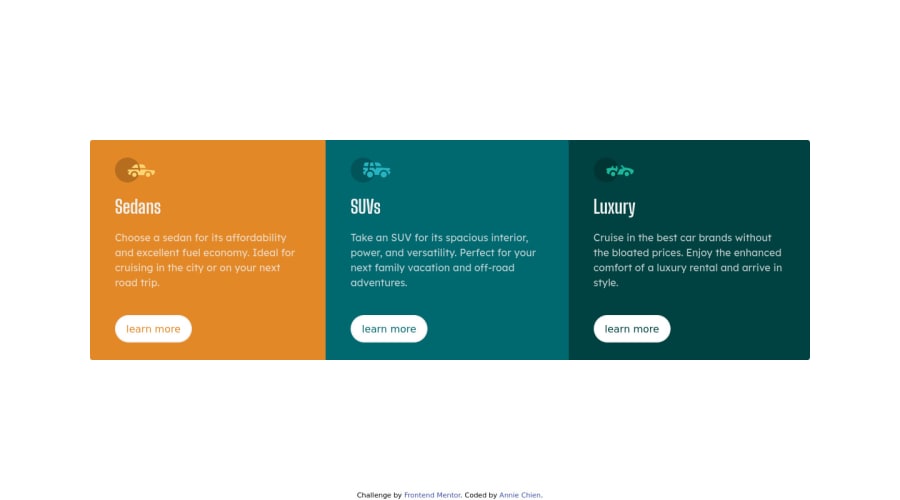
Design comparison
Community feedback
- @VCaramesPosted about 2 years ago
Hey there!👋 Here are some suggestions to help improve your code:
- The specify the main content of you site and allow screen readers to skip directly to it, you will want to encase your entire component inside a Main Element.
-
Stay away from using libraries until you fully grasp the fundamentals. This is the purpose of this challenges.
-
The car images/icons in this component are purely decorative; They add no value. So their Alt Tag should left blank and have an aria-hidden=“true” to hides them from assistive technology.
-
The headings have to be uppercase to better match the FEM example.
-
Your "buttons" were created with the incorrect element. When the user clicks on the button they should directed to a different part of you site. The Anchor Tag will achieve this.
If you have any questions or need further clarification, let me know.
Happy Coding! 👻🎃
0
Please log in to post a comment
Log in with GitHubJoin our Discord community
Join thousands of Frontend Mentor community members taking the challenges, sharing resources, helping each other, and chatting about all things front-end!
Join our Discord
