Not Found
Not Found
Not Found
Not Found
Not Found
Not Found
Not Found
Not Found
Not Found
Not Found
Not Found
Not Found
Not Found
Not Found
Not Found
Not Found
Not Found
Not Found
Not Found
Not Found

Submitted

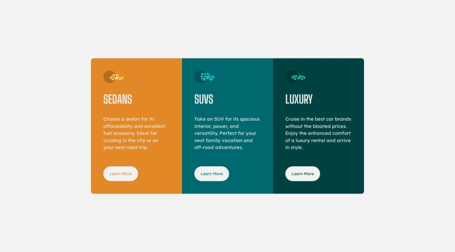
3-Col-Preview-Card-Component using CSS Flexbox

@dashaunn

Desktop design screenshot for the 3-column preview card component coding challenge

This is a solution for...

  • HTML
  • CSS
1newbie
View challenge

Design comparison


SolutionDesign

Solution retrospective


This project was insightful! It took me a while to understand how to properly use flexbox.

I have a few questions:

  • Is the semantic HTML of my document okay?
  • Is there a neat way to measure out sizes of things? I find myself squinting and tweaking sizes a lot to match the design.
  • I would appreciate any tips on best practices for my CSS! (On media queries, organization, etc. )

Thank you πŸ™

Community feedback

@MelvinAguilar

Posted

Hello there πŸ‘‹. Good job on completing the challenge !

I have other suggestions about your code that might interest you.

  • Consider adopting a Mobile First approach in your next project. This means designing for the smallest screens first and then scaling up as needed. This helps to create a more user-friendly and accessible experience for all users.
  • You should use only one <h1> tag per page. The <h1> tag is the most important heading tag, This can confuse screen reader users and search engines. This challenge requires that Sedans, SUVs and Luxury are headings, but you can use the <h2> tag instead of the <h1> tag. You can read more about this here πŸ“˜.
  • Not all images should have alt text. Car icons are for decoration purposes only, so they can be hidden from screen-readers by leaving its alt attribute empty. You can read more about this here πŸ“˜.

I hope you find it useful! πŸ˜„ Above all, the solution you submitted is great!

Happy coding!

Marked as helpful

3

@dashaunn

Posted

Thank you for your helpful response @MelvinAguilar!! πŸ™

Oh wow that's embarrassing πŸ˜… I know better than to add more than one h1 element. Thank you for noticing that!

Thank you for the advice and resources Melvin, this is all really good to know. I will try a mobile first approach in my next projects. Thank you again!! 😁

1
Daniel πŸ›Έβ€’ 44,230

@danielmrz-dev

Posted

Hello @dashaunn!

Your project looks great!

On your questions:

  • Is the semantic HTML of my document okay?

Yes. Only thing I'd do different is to use only the main tag, instead of both main and article. Unless you did that for a specific reason, there's no need to use both when just one can do the job.

  • Is there a neat way to measure out sizes of things? I find myself squinting and tweaking sizes a lot to match the design.

Without the figma file, we all guess the sizes πŸ˜…

  • I would appreciate any tips on best practices for my CSS! (On media queries, organization, etc. )

You CSS is great. I'd just increase your media queries breakpoint to show your desktop version only if the screen has at least 650px. Between 650px and 375px (your current breakpoint) your main content gets squeezed.

I hope it helps!

Other than those little details, you did an excelent job!

Marked as helpful

1

@dashaunn

Posted

Thank you so much for your thorough response @danielmrz-dev!! πŸ™πŸ˜„

This is really helpful, I will make some adjustments to my project now. 😁

1

Please log in to post a comment

Log in with GitHub
Discord logo

Join our Discord community

Join thousands of Frontend Mentor community members taking the challenges, sharing resources, helping each other, and chatting about all things front-end!

Join our Discord