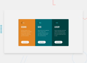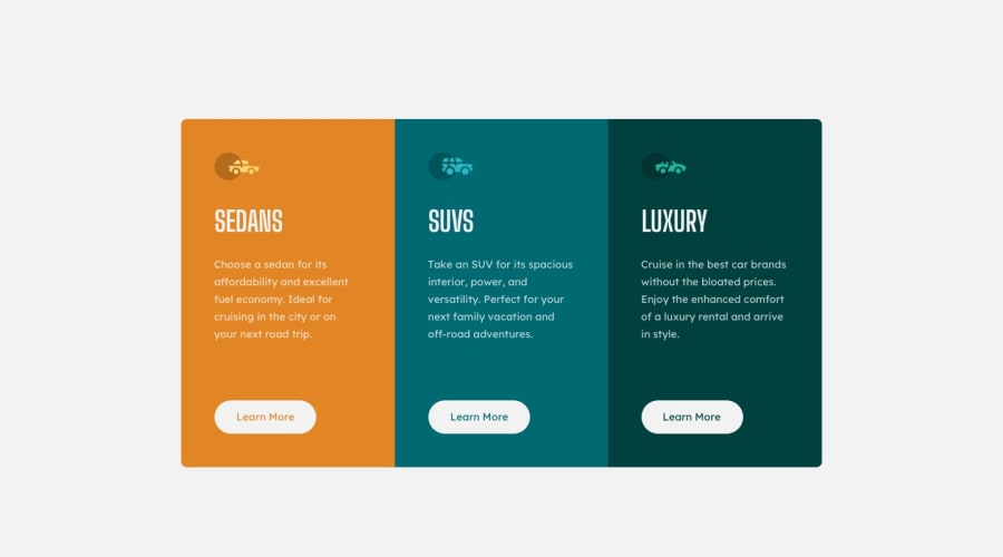
Design comparison
Community feedback
- @correlucasPosted about 2 years ago
👾Hello Kevin JH Li, Congratulations on completing this challenge!
Nice solution and nice code! I can see that you paid a lot of attention to your code/design. If you don’t mind I’ve some tips for you:
1.Improve the card overall look adding the rounded borders to the component using
border-radius: 15px2.Your solution seems fine, you did a really good job wrapping the content for these 3 cards. Something you can improve here is to use a
single classto manage the content that is mostly the same for the 3 cards (paddings, colors, margins and etc) and another class to manage the characteristics that are different (colors and icon), this way you'll have more control over then and if you need to change something you modify only one class.3.Improve your html markup using meaningful tags to wrap the content, you can replace the div you’ve used for each card with <article>. Remember to wrap big blocks of content with semantic tags and never divs, use divs for small blocks.
✌️ I hope this helps you and happy coding!
0@kein-1Posted about 2 years ago@correlucas Thank you! I couldn't figure out why the border-radius wasn't working after a while so I just left it as it is.
For points 2 and 3, noted! I will keep that going forward. I did not know <article> was even a tag.
0
Please log in to post a comment
Log in with GitHubJoin our Discord community
Join thousands of Frontend Mentor community members taking the challenges, sharing resources, helping each other, and chatting about all things front-end!
Join our Discord
