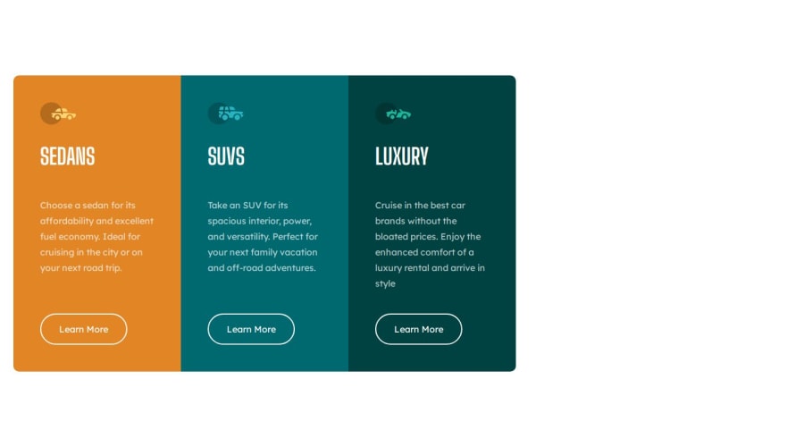
Design comparison
SolutionDesign
Solution retrospective
What are you most proud of, and what would you do differently next time?
adjustments are improved and will be device accessible soon
What challenges did you encounter, and how did you overcome them?all devices compatability
What specific areas of your project would you like help with?device adjustments
Community feedback
Please log in to post a comment
Log in with GitHubJoin our Discord community
Join thousands of Frontend Mentor community members taking the challenges, sharing resources, helping each other, and chatting about all things front-end!
Join our Discord
