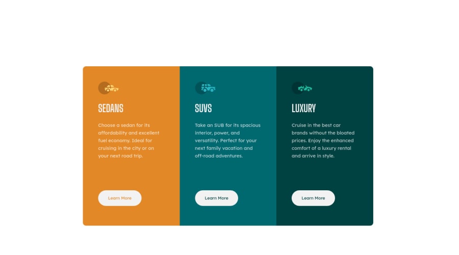
Design comparison
Solution retrospective
Hi Community,
I'm pretty new at CSS and can use some advice. I have a horizontal scoll in my mobile version. Any ideas on how to fix this?
Community feedback
- @LudovicLefieuxPosted over 3 years ago
Hey Gordon !
I just checked your code and I think your problem comes from the width you set for .page-container, .container and the different columns. You need to set these to width: auto in your mobile version. I hope I was able to help you.
Good luck ;)
Marked as helpful0@Nielsm987Posted over 3 years ago@LudovicLefieux
Hi Luduvic, Thanks for the feedback this makes perfect sense. 😀
0@LudovicLefieuxPosted over 3 years ago@Nielsm987 You're welcome ! You can check my solution if you want. It may help you : https://github.com/LudovicLefieux/3-column-preview-card-component-main
0
Please log in to post a comment
Log in with GitHubJoin our Discord community
Join thousands of Frontend Mentor community members taking the challenges, sharing resources, helping each other, and chatting about all things front-end!
Join our Discord
