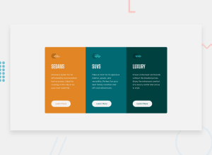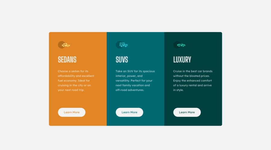
Design comparison
Solution retrospective
Generated with more <article> tag than <div> which is recommended. I have also added a transition on the buttons for a better visual effect. '.vinculo:hover{ margin: 45px auto 50px 45px; text-align: center; font-family: 'Lexend Deca', sans-serif; background-color: var(--Bright_orange); padding: 16px 21px; border-color: white; color: white; border-width: 1px; margin-top: 45px transition:all .9s; border-style: double; }' Any opinion is welcome
Community feedback
- @shashreesamuelPosted over 2 years ago
Hey good job completing this challenge
Keep up the good work
Your solution looks great however I think that each individual section needs a bit more padding. Secondly the button needs less padding on the top and a bit more on the left and right.
I hope this helps
Cheers Happy coding 👍
1
Please log in to post a comment
Log in with GitHubJoin our Discord community
Join thousands of Frontend Mentor community members taking the challenges, sharing resources, helping each other, and chatting about all things front-end!
Join our Discord
