Design comparison
Solution retrospective
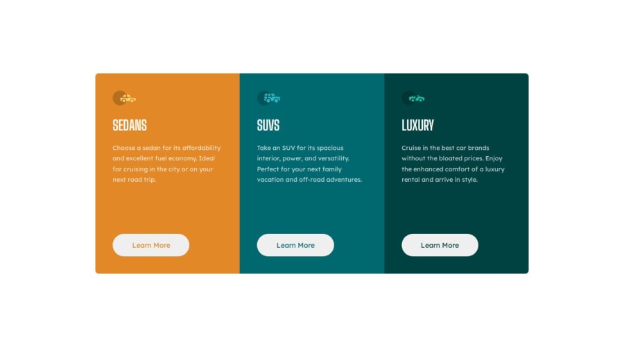
I was able to practice grid and did it in less time than usual. I feel like i'm finally getting the hang of it slowly.
What challenges did you encounter, and how did you overcome them?I think the only challenge I encountered was again converting from a mobile layout to a desktop layout lol. But, I ended up doing it so that's something that's very cool
What specific areas of your project would you like help with?When I increase the width of the screen slowly the buttons don't move together. They instead move with the paragraph getting longer and shorter. Any help on that would be highly appreciated. I did get away with this one lol
Community feedback
- @Islandstone89Posted 6 months ago
Great job!
Some suggestions:
HTML:
-
The icons are decorative, so the alt text should be empty:
alt=""
. -
There should only be one
<h1>
on a page. Given 3 similar headings, I would change all of them into a<h2>
. -
"Learn More" would navigate to another page, hence it is not a button but a link.
CSS:
-
max-width
on.row
should be inrem
. -
Media queries should also be in
rem
, orem
. -
Nice to see that you have a
.flow
class, I use that on every project :) However, I like to set it up this way:
First, I'll create a
.flow
class, which has a Custom Property called--flow-space
, with a default value, let's say it's 2rem:.flow { --flow-space: 2rem; }
Then, I'll add a top margin on every direct child of a flow element, except the first one:
.flow > * + * { margin-block-start: var(--flow-space; }
I use
margin-block-start
instead ofmargin-top
because I prefer using logical properties.I hope this makes sense :)
1 -
- @RoksolanaVeresPosted 6 months ago
Hi, first of all your code is super clean and structured, great job!
Regarding your problem with the buttons: I've just checked my solution of this challenge and found the same issue there 😅 but I've also come up with an idea of how to fix it.
This occurs because we're applying a large margin to the buttons to position them at a specific distance from the text. Since the length of the text on each card varies, the buttons are pushed to different distances, causing them not to align.
The simplest way to fix it is to give smaller margin to buttons and instead set a fixed height to the paragraphs with car description. This height should be large enough to hold the longest text when the width of the card is the smallest.
Here is how I see it:
HTML (for each of the card)
<div class="cols sedan flow bg-primary-orange"> <img alt="sedan icon" src="images/icon-sedans.svg" /> <h1>Sedans</h1> <p class="car-description"> Choose a sedan for its affordability and excellent fuel economy. Ideal for cruising in the city or on your next road trip. </p> <button class="btn text-secondary-orange">Learn More</button> </div>
CSS
@media (min-width: 800px) { ... .flow button { margin-top: 2rem; } .car-description { height: 10rem }
That's all. Happy coding!
0
Please log in to post a comment
Log in with GitHubJoin our Discord community
Join thousands of Frontend Mentor community members taking the challenges, sharing resources, helping each other, and chatting about all things front-end!
Join our Discord