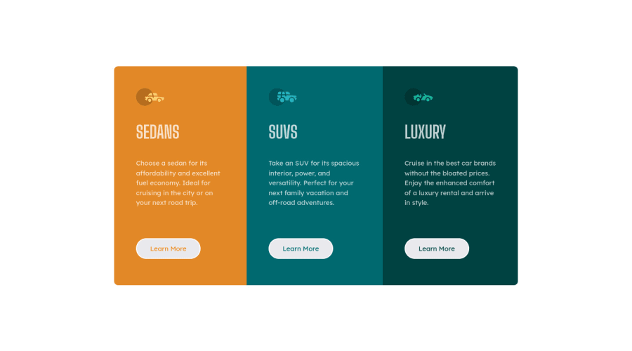
Design comparison
SolutionDesign
Solution retrospective
Feel free to review my code and please send feedbacks for me to keep improving.
Community feedback
- @VCaramesPosted almost 2 years ago
Hey there! 👋 Here are some suggestions to help improve your code:
- This
<div class="container flex">is not necessary ❌.
- The “car icons” in this component are purely decorative⚠️. Their
alt tagshould be left blank to remove them from assistive technology.
More Info:📚
https://www.w3.org/WAI/tutorials/images/
- Do not capitalize❌ "sedans", "suvs" and "luxury" in HTML as it is not accessible friendly. Instead you will want to style it in CSS.
- Your "buttons" were created with the incorrect element ❌. When the user clicks on the button they should be directed to a different part of you site. The
anchor tagwill achieve this.
More Info:📚
If you have any questions or need further clarification, you can always check out my submission and/or feel free to reach out to me.
Happy Coding! 👾
Marked as helpful1 - This
Please log in to post a comment
Log in with GitHubJoin our Discord community
Join thousands of Frontend Mentor community members taking the challenges, sharing resources, helping each other, and chatting about all things front-end!
Join our Discord
