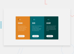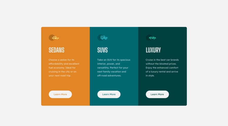
Design comparison
Solution retrospective
I was able to finish this project fairly quickly.
What challenges did you encounter, and how did you overcome them?I had a little trouble with the text color on the buttons during the active state, but then I remembered that I could use !important to make it work.
What specific areas of your project would you like help with?Nothing specific comes to mind, but if anyone has any constructive criticism, I'm willing to accept it!
Community feedback
- @Islandstone89Posted 8 months ago
HTML:
-
There should only be one
<h1>on a page. Given there are 3 similar headings, I would change all of them into a<h2>. -
"Learn More" would navigate to another page, hence it is not a button but a link.
-
Wrap footer text in
<p>.
CSS:
-
Including a CSS Reset at the top is good practice.
-
Remove the width on the card container.
-
Add a
max-widthof around50remon the card container, so it doesn't get too wide on larger screens. -
On the
body, changeheighttomin-height- this way, the content will not get cut off if it grows beneath the viewport. -
font-sizemust never be in px. This is a big accessibility issue, as it prevents the font size from scaling with the user's default setting in the browser. Use rem instead. -
Paragraphs have a default value of
font-weight: 400, so there is no need to declare it. -
Media queries should be in rem instead of
px.
Marked as helpful0 -
Please log in to post a comment
Log in with GitHubJoin our Discord community
Join thousands of Frontend Mentor community members taking the challenges, sharing resources, helping each other, and chatting about all things front-end!
Join our Discord
