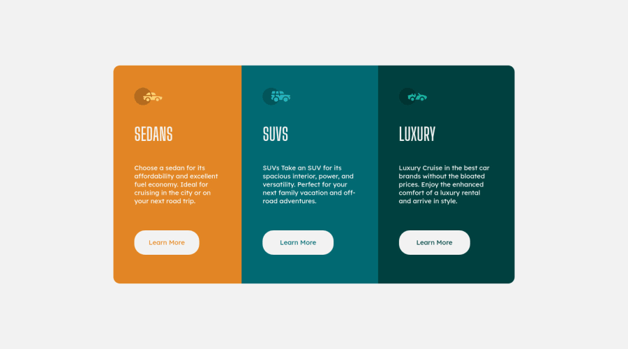
Design comparison
Solution retrospective
It took me an hour to finish this. There is this slight push to top when you hover the button. I don't know what caused that.
Community feedback
- @aleksandr-efimenkoPosted over 1 year ago
Hello @frkanyilmaz2,
Great job!
The reason why the button moves slightly when hovering is due to the border property. When you add a border to an element, it increases the size of the element, which can cause it to shift position. To prevent this from happening, you can use the
outline: 1px solid #f2f2f2;
property instead ofborder
in your.buttons:hover
styles. Theoutline
property will add a border-like effect without changing the size of the element, so there won't be any shifting when you hover.Alternatively, you can add a transparent border to your .buttons styles. This will create space for the border to be added when you hover, without changing the size of the button. You can do this by adding
border: 1px solid transparent
to your .buttons styles.I hope this additional information is helpful to you in understanding the cause of the issue and providing alternative solutions to fix it.
Marked as helpful1@frkanyilmaz2Posted over 1 year ago@androidblog Thanks for your interest and information. I appreciate it.
0 - @adonmez04Posted over 1 year ago
Hi, @frkanyilmaz2. It's a good solution. Keep coding. I have some suggestions for you.
The HTML Structure
- Use the anchor element
a
instead ofbutton
.a
element is used asCTA - call the action
button. If you link somewhere or something, you can usea
. You can usebutton
element to send a form as asubmit
button. Keep it simple and usea
element for your links. Be aware, the anchor element hasdisplay: inline
for its initial value. You should change this todisplay: inline-block
to give it the padding and margin values. - Use BEM notation to add classes to your elements. This will help lower the specificity of your selectors and avoid any conflicting declarations.
- Don't omit
alt
attribute in the img element. It's necessary for the screen readers and search engines and you can also need some of the information about the images when they break.
The CSS Properties
-
Don't use the
!important
keyword to override your style. Use specificity to override any declarations. You can use!important
keyword in exceptional situations, but not all the time. -
Don't omit your text styles. The text will give you content values like
width
andheight
for your layout. Check the design file in figma and be sure to give all of the font styles to your content. -
Your solution should look as much the same as the design as possible. You can check your solution and fix some major mistakes.
-
As an advanced recommendation, you can try to solve the challenge again and again based on good comments and good implementations. This will improve your coding skills more than you think.
I hope these will help you to improve your perspective. Keep coding. All the best.
Marked as helpful1 - Use the anchor element
Please log in to post a comment
Log in with GitHubJoin our Discord community
Join thousands of Frontend Mentor community members taking the challenges, sharing resources, helping each other, and chatting about all things front-end!
Join our Discord