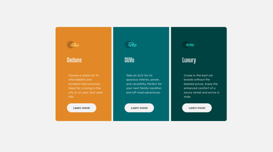
Design comparison
SolutionDesign
Solution retrospective
wait why it looked cracked in the screenshot but nice in the live site?
Community feedback
- @rachanahegdePosted over 3 years ago
Hi! The screenshot looks fine. Nice work! To fix your accessibility issues, you need to add some semantic HTML tags like <header> and <main>.
1
Please log in to post a comment
Log in with GitHubJoin our Discord community
Join thousands of Frontend Mentor community members taking the challenges, sharing resources, helping each other, and chatting about all things front-end!
Join our Discord
