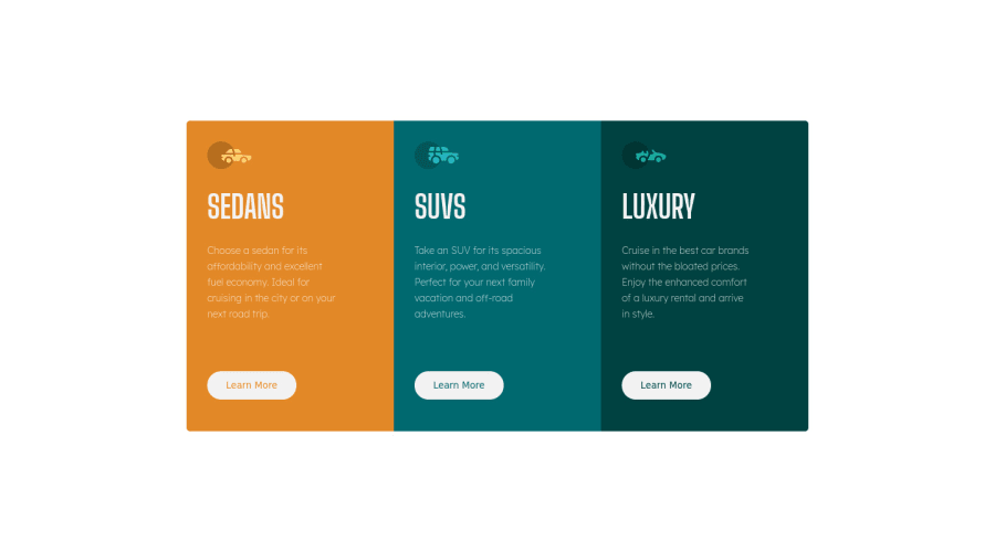
3 Column preview component optimized for mobile 375px
Design comparison
Solution retrospective
Is it best to learn Bootstrap to develop mobile responsive sites? Are media queries outdated?
Any recommendations for improving responsive design will be welcome as I'd like to start honing those skills to ramp up the challenge difficulty.
Community feedback
- @VCaramesPosted about 2 years ago
Hey there!👋 Here are some suggestions to help improve your code:
-
Your car images/icons need to have a Blank Alt Tag Along with the blank alt tag, you also want to include an aria-hidden=“true” to your to fully remove it from assistive technology.
-
The headings in your component are being used incorrectly. Since the <h1> Heading can only be used once, it is always given to the heading with the highest level of importance. This component has three headings of equal importance, so the best option would be to use an <h2> Heading, since it is reusable and it will give each heading the same level of importance.
-
Your "buttons" were created with the incorrect element. When the user clicks on the button they should directed to a different part of you site. The Anchor Tag will achieve this.
-
Your content is not fully responsive. Here is a link to Google Developer’s site that will teach you how make it 100% responsive:
If you have any questions or need further clarification, let me know.
Happy Coding! 👻🎃
Marked as helpful0 -
- @correlucasPosted about 2 years ago
👾Hello @Roneeey, Congratulations on completing this challenge!
Great code and great solution! I’ve few suggestions for you that you can consider adding to your code:
- Add the correct color for the background, that in this case is
background-color: #F2F2F2
- The html structure entirely with
div blocks
but these div doesn't any semantic meaning, for this reason is better you use a better html markup improving your code, for example for each vehicle card you use<article>
instead of the<div>
. - The icon doesn’t have an important role when you think about semantics and the html structure. So you can add
aria-hidden=“true”
to avoid it being found and read in the accessibility mode/screen readers. These are only decorative items. - Use
max-width: 100%
for the cards in the mobile version to allow the cards grow 100% of the width considering the paddings and avoid to have a lateral gap (limited by a fixed width). - To make your CSS code easier to work you can create a
single class
to manage the content that is mostly the same for the 3 cards (paddings, colors, margins and etc) and another class to manage the characteristics that are different (colors and icon), this way you'll have more control over then and if you need to change something you modify only one class.
✌️ I hope this helps you and happy coding!
Marked as helpful0 - Add the correct color for the background, that in this case is
- @AlexAgustiniPosted about 2 years ago
Hey man, good code, but i spotted a problem: although your site works in 1440 and 375px, it breaks in between this widths, in like tablet widths, so to fix that, you can try to give your container a "width:min(90vw, 1000px)" for example, so that below your container occupies 90vw of the screen, but have a maximum width of 1000px, which would help on bigger screens so the text don't get too stretchy
Marked as helpful0@RoneeeyPosted about 2 years ago@AlexAgustini Thanks pal. I only did it for portrait on a mobile for now. I want to do a good course on responsive design and then try practice with these or future projects. Any course recommendations for that?
I see there are a few under the resources section on this site.
0@AlexAgustiniPosted about 2 years ago@Roneeey for responsive design i went fully with Kevin Powell. Honestly, everything CSS related i watch him haha, so i recommend him, there's a lot of free content and he's really didactic
Marked as helpful0
Please log in to post a comment
Log in with GitHubJoin our Discord community
Join thousands of Frontend Mentor community members taking the challenges, sharing resources, helping each other, and chatting about all things front-end!
Join our Discord