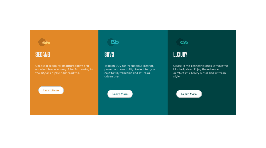
Design comparison
Solution retrospective
Any suggestions on how can I improved :)
Community feedback
- @hyrongennikePosted about 2 years ago
HI @chigyong,
Nice job on the challenge just check on mobile the columns are super narrow. You can fix this by adding the following to your mobile media query.
.info {
    margin: 1rem;
}
Also look at the report and fix those issues they are important and look into semantic HTML for example you can swap out the
<div class="container">with<main class="container">that will already fix one the accessibility issues in the report.This is just something to keep in mind for the next challenges. If you want center something in the middle of the page use the following.
.container {
    display: flex;
    justify-content: center;
    align-items: center;
    min-height: 100vh;
}
You would then remove the
margin: 10rem;on the div#myID div and replace it with.div#myID { max-width: 800px; }Hope this is help let me know if you have any other questions.
Marked as helpful1 - @correlucasPosted about 2 years ago
👾Hello @chigyong, congratulations for your new solution!
🎨 You’ve done really good work here putting everything together, I’ve some suggestions to improve the design:
1.You need to include the title for you PAGE. Do that inserting in the <head> the tag <title> →
<title>3 Column Preview Card - Front End Mentor</title>2.Add the website favore icon inserting the svg image inside the
<head>.<link rel="icon" type="image/x-icon" href="./images/favicon-32x32.png">3.Your solution seems fine, you did a really good work wrapping the content for these 3 cards. Something you can improve here is to use a
single classto manage the content that is mostly the same for the 3 cards (paddings, colors, margins and etc) and another class to manage the characteristics that are different (colors and icon), this way you'll have more control over then and if you need to change something you modify only one class.4.About the semantics, you can replace all blocks that you've used
<div>and replace with<article>thats a better html markup for this situation.✌️ I hope this helps you and happy coding!
Marked as helpful0
Please log in to post a comment
Log in with GitHubJoin our Discord community
Join thousands of Frontend Mentor community members taking the challenges, sharing resources, helping each other, and chatting about all things front-end!
Join our Discord
