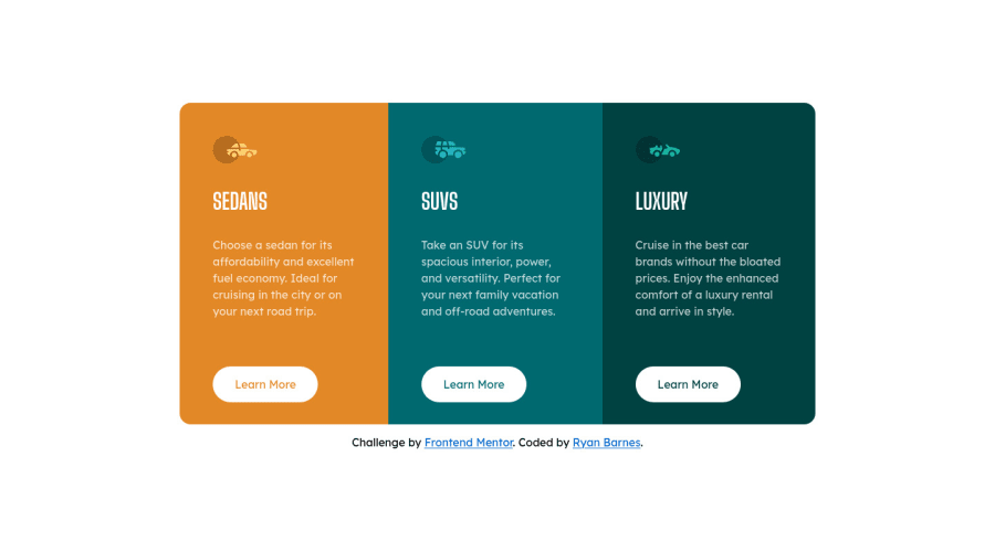
Design comparison
SolutionDesign
Solution retrospective
Super simple, but built as a Svelte component with the ability to pull in objects to populate the content.
Community feedback
Please log in to post a comment
Log in with GitHubJoin our Discord community
Join thousands of Frontend Mentor community members taking the challenges, sharing resources, helping each other, and chatting about all things front-end!
Join our Discord
