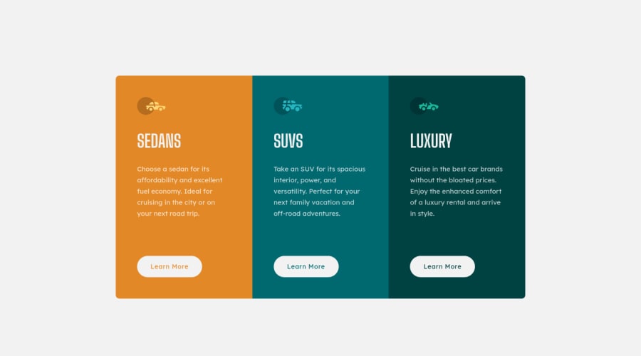
3 COLUMN PREVIEW CARD USING HTML5, CSS GRID AND FLEX BOX
Design comparison
Solution retrospective
Hi, please help me check if my solution is responsive on your device. What do you think I need to do to improve my codes?
Community feedback
- @JulioCinquinaPosted about 2 years ago
Hey, Nwali! Congratulations on your solution!
It looks pretty much identical to the design. Nice job!
Here are my suggestions:
- Use the
<a>
element instead of<button>
. A "Learn More" button is usually a link that takes the user to a different page. In general, the<button>
element is used for actions that are implemented via JavaScript, such as adding a product to the cart in an online store. You can learn more about this in this article: A Complete Guide to Links and Buttons by Chris Coyier. - Give ARIA labels to the buttons to improve accessibility. Screen reader users can navigate the page from link to link. Because of that, link text should be descriptive and make sense without the surrounding context. You can read more about this and see examples in this guide: ARIA8: Using aria-label for link purpose by W3C Web Accessibility Initiative. Here's an example:
<h2>Sedans</h2> <a href="#" aria-label="Learn more about sedans">Learn More</a> <!-- ... -​-> <h2>SUVs</h2> <a href="#" aria-label="Learn more about SUVs">Learn More</a> <!-- ... -​-> <h2>Luxury</h2> <a href="#" aria-label="Learn more about luxury cars">Learn More</a>
I hope this helps! Keep coding! 💻
Marked as helpful1@Source-WebPosted about 2 years ago@JulioCinquina Hi, Julio. Thank you for your feedback. I'll do implement them... Also, I have another issue with this project. When the solution is viewed on a mobile in a browser, say chrome, and the desktop site checkbox checked, the text does not scale well. I don't know what caused this. Can you help me take a look?
0@JulioCinquinaPosted about 2 years ago@Source-Web This varies from browser to browser.
On an Android phone, Firefox shows the desktop version just fine when "Desktop site" is checked, but in Chrome the text looks big on desktop mode, making the columns very narrow.
I'm not sure why this works, but using Flexbox to organize the contents of the columns makes the desktop mode work in Chrome for Android. All I had to do was add this code to your
.sedan
,.suvs
and.luxury
classes:display: flex; flex-direction: column; justify-content: flex-start; align-items: flex-start;
As a side note, using Flexbox has another advantage in this case: you can give your buttons
margin-block-start: auto
to push them to the bottom of the column. With this, the buttons will always be aligned at the bottom, even if the user has set a different default font size in their browser or has zoomed in on the page (which could make the paragraphs have different sizes).Going back to the desktop mode issue, I also tested it on Safari in iOS, and it will always show the mobile version. I'm not sure yet how to make desktop mode work in iOS Safari.
However, taking a step back from this, it could be said that the user would only use the desktop mode on a mobile device if something was missing from the mobile version of the website. If the mobile version is just as good and complete as the desktop version, the desktop mode on mobile would never be needed.
In fact, around 63% of users worldwide use a mobile device to browse the web according to recent Desktop vs Mobile vs Tablet Market Share Worldwide statistics by Statcounter. Because of that, many websites today are designed with a mobile-first approach. In practice, this means — among other things — making the mobile version of the website first, and then using media queries with
min-width
to create the desktop version.I hope this was helpful. Keep coding! 💻
Marked as helpful1@Source-WebPosted about 2 years ago@JulioCinquina Thank you for this detailed reply. I'll have to learn more about responsiveness and CSS flex. My other solutions were just fine with the desktop-site checked, I'll still review my code, maybe I added something I shouldn't have.
0 - Use the
Please log in to post a comment
Log in with GitHubJoin our Discord community
Join thousands of Frontend Mentor community members taking the challenges, sharing resources, helping each other, and chatting about all things front-end!
Join our Discord