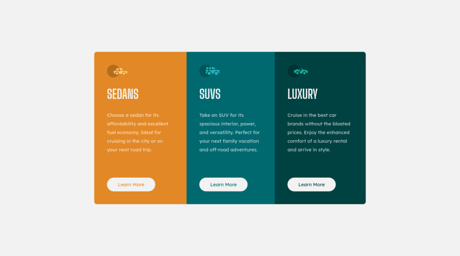


Design comparison

Solution retrospective
This was my first attempt using CSS Grid. I quite like how easy it is to change the layout using media queries.
I do have two questions though:
-
Regarding media queries, is it better practice to put them at the end of your CSS document, or under the section that it affects, like I've done with this challenge?
-
In this challenge, I've disguised an anchor tag as a button. Is it better practice to rather use
<button></button>and nest theatag in that? I find the styling to be more difficult doing it that way though, but I worry later down the line I won't be able to "submit" data.
Thanks for the help!
Community feedback
- @romila2003Posted over 2 years ago
Hi Wesley,
Congratulations 🎉 on completing this challenge, it was a great attempt.
- Regarding the position of where you place your media queries, I think that is up to you. Some may decide to place it at the end however others may do it under the part where they are changing the code such as under the card.
- For the anchor tag, I think it would be better to code it as a
buttoninstead of nesting it inside of theatag. This is because, you can submit the data through the button. Theatag would be more appropriate for things such as social media icons as they send you to your social media pages. With a button, the code will look something like this:
<button class="btn" type="submit"></button>Overall, great attempt and wish you the best for your future projects so keep coding 👍.
Marked as helpful1@wesleyjacobyPosted over 2 years ago@romila2003 Hi Romila,
That's what I was afraid of - I'll go back into the code and change it up.
Thanks for the help!
1 - @LucianoDLimaPosted over 2 years ago
Well done on completing this challenge!
-
Regarding the media queries. That's up to you. For me, using media queries right below where it's targeting is better because then I don't have to keep scrolling up and down to see where I have to change and whatnot. If you ever try to learn SCSS you'll see that this becomes a lot easier since you can actually nest your media queries inside the targeted area, which is awesome.
-
Regarding the button vs a. That's something I wonder myself but in my opinion it is related to action. The
<a>tag will always take you somewhere, be it another page, or another section of your own page, whereas the<button>will make something happen, so for example in a<form>the<button>will submit the information provided, or a dark mode switch button will make the page change colors and so on. So the<a>tag will take you somewhere, and the<button>tag will make something happen in the page. -
Regarding your project. I think it looks very good, well done! A thing I would add is a
transition: all 150ms ease-in;to your.learn-more-btnclass. That will make your hover feels smooth and clean.
Happy coding!
Marked as helpful0@wesleyjacobyPosted over 2 years ago@LucianoDLima Hi Luciano,
Awesome - I also prefer using the media queries right below the target code.
I'll definitely change the code to reflect
<button>. If I don't, it'll bite me later when I move onto more complex designs and functionality, I think.I love the transition property - Looks and feels smooth! I'll use it in my other projects as well, from now on.
Thanks for the tip and help!
1 -


Please log in to post a comment
Log in with GitHubJoin our Discord community
Join thousands of Frontend Mentor community members taking the challenges, sharing resources, helping each other, and chatting about all things front-end!
Join our Discord