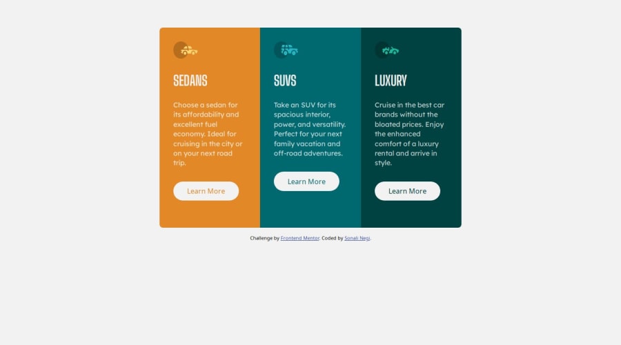


Design comparison

Community feedback
- @its-subhashPosted about 1 year ago
Hey @SONALI-NEGI your solution looks good but I have some suggestions to make for your Coding practice and Responsive design
- Coding Practice:
Everthing works beautifully but you can avoid writing same lines again, while using media query I saw that you are defining colors of card again but you don't have to do so because css will automatically take whatever color is defined previously.
Also removing some unnecessary properties like in line 94 of style.css writing
margin: auto autocan be reduce to writingmargin:autoonly.- Responsiveness:
It is a good idea to not align cards vertically untill screen size is significantly narrow like screen width of 450px or 375px, that way it'll look much better, right now as you go smaller than 900px...cards just strech too much and looks good only when you reach mobile screen size.
Lastly about border radius of this project, I saw you defining borders on so many places and then taking care of it while changing to other screen size...
One better approach I could think of is to put all three card inside a single div, and defining border only once, it won't work in start(because I tried it myself) but once you define this divs
overflow:hiddenit'll work amezing and you don't have to care about it everywhere...you can refer my solution to get what am taking about, but believe me it's really WORTH TRYING.
That's all...I hope you'll find these suggestions helpfull.
Happy Coding
0@SONALI-NEGIPosted about 1 year agoHey @its-subhash , thank you so much for taking the time to review my solution and providing such detailed suggestions for improvement. I really appreciate your insights! I've implemented the changes you recommended, including simplifying the CSS to avoid redundancy, and adopting your clever approach to border radius using a single div for all cards. The code looks much cleaner and more efficient now. Happy coding to you too, and thanks again for taking the time to share your expertise!
1

Please log in to post a comment
Log in with GitHub
Join our Discord community
Join thousands of Frontend Mentor community members taking the challenges, sharing resources, helping each other, and chatting about all things front-end!
Join our Discord