Not Found
Not Found
Not Found
Not Found
Not Found
Not Found
Not Found
Not Found
Not Found
Not Found
Not Found
Not Found
Not Found
Not Found
Not Found
Not Found
Not Found
Not Found
Not Found
Not Found

Submitted

3 column preview card- Using Grid

EJ 100

@ejionaut

Desktop design screenshot for the 3-column preview card component coding challenge

This is a solution for...

  • HTML
  • CSS
1newbie
View challenge

Design comparison


SolutionDesign

Solution retrospective


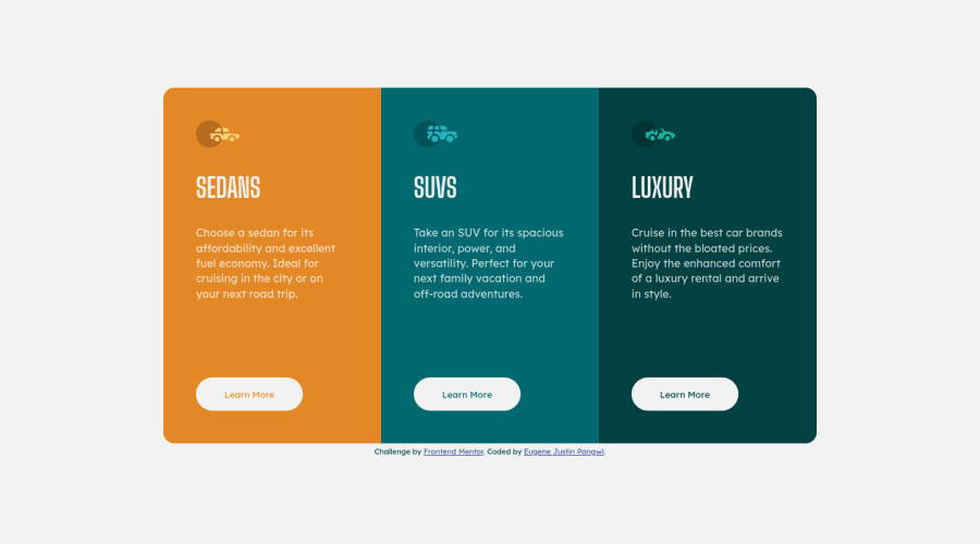
I'm still currently playing around with grids. For this exercise, I am not sure why the container wasn't wrapping when I adjusted the size. So I just set the column flow to row when adjusted.

Any feedback is welcome!

Community feedback

PhoenixDev22 16,950

@PhoenixDev22

Posted

Hello EJ,

Great work! Congratulation on completing this challenge. I have some suggestions regarding your solution if you don't mind:

HTML

  • About <h1>it is recommended not to have more than one h1 on the page . Multiple <h1>tags make using screen readers more difficult, decreasing your site’s accessibility. You can add a <h1> with class="sr-only" (Hidden visually, but present for assistive tech).
  • In this challenge , all the images are decorative. For any decorative images, each img tag should have empty alt="" as you did and aria-hidden="true" attributes to make all web assistive technologies such as screen reader ignore those images .
  • What would happen when the user click those learn more?In my opinion, clicking those "learn more" would likely trigger navigation not do an action so button elements would not be right. So you should use the <a>. For future use , it's a good habit of specifying the type of the button to avoid any unpredictable bugs.
  • On your buttons, add border: 2px solid transparent; to the regular state. This way when the hover on the buttons , it doesn't add an additional 4 pixels to the height and width making the elements shift.

Overall, Great job on this one.

Marked as helpful

0

EJ 100

@ejionaut

Posted

@PhoenixDev22 I was wondering why the hover was affecting the height it was because of that. Thanks for the feedback!

1
PhoenixDev22 16,950

@PhoenixDev22

Posted

@ejionaut Happy coding!

0
raionus 310

@sinjin25

Posted

Good job, especially on the the padding between card sections. I messed that up on my solution.

I think that your font-size is slightly too big on the body text and the button text is slightly too small. Very good work though.

You might want to use a position: fixed on the attribution text so that it's taken out of the document flow. This will help your solution line up with the design on the design comparison

Marked as helpful

0

EJ 100

@ejionaut

Posted

@sinjin25 I see I've been trying to eye it but it's always off a bit, Tyvm! :))

1
raionus 310

@sinjin25

Posted

@ejionaut It's tough for sure!

0

Please log in to post a comment

Log in with GitHub
Discord logo

Join our Discord community

Join thousands of Frontend Mentor community members taking the challenges, sharing resources, helping each other, and chatting about all things front-end!

Join our Discord