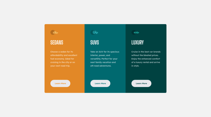
Design comparison
Solution retrospective
Hi Guys! Received some very helpful feedback and refactored my first solution. I improved the HTML markup, changed some values that were still in px to relative units, removed the 'alt' attribute in the images as it was only decorative and changed the 'cursive' font property to 'sans-serif' to avoid getting 'Comic Sans'. Let me know if I missed something. Big thanks again to Lucas and Deniel!
Community feedback
- @elaineleungPosted over 2 years ago
Great work Deborah! This looks really good, and I think the responsiveness is quite well done. I just got two suggestions:
-
At around the 660px breakpoint when the layout changes, the sides of the component are touching the sides of the browser, so I'd probably just add some spacing to keep that from happening (maybe
margin: 1remwould be good enough!) -
Your report is giving you some issues about missing alt tags, and actually even for decorative images, you still need the alt tag in the
img, but you can keep it empty, like this:<img scr="image.png" alt="" >
Once again, well done here, and I'm glad you got improve upon your old solution!
Marked as helpful1@debriksPosted over 2 years ago@elaineleung Hi Elaine! Thank you to have taken the time to give me some feedback! I'm going to correct the code following your comments!
0 -
- @Deevyn9Posted over 2 years ago
Hi Deborah, congrats on completing this project, the buttons aren’t displaying on mobile, 375px width using safari.
Hope you find the solution soon.
Good luck
Marked as helpful1@debriksPosted over 2 years ago@Deevyn9 Hi Divine! I'll look into it! Thank you for your feedback!
0 - @correlucasPosted over 2 years ago
👾Hi Deborah Robbiano, congrats on completing this challenge!
Nice solution and nice code! I can see that you paid a lot of attention to your code/design. If you don’t mind I’ve some tips for you:
To make your CSS code easier to work you can create a
single classto manage the content that is mostly the same for the 3 cards (paddings, colors, margins and etc) and another class to manage the characteristics that are different (colors and icon), this way you'll have more control over then and if you need to change something you modify only one class.✌️ I hope this helps you and happy coding!
Marked as helpful0
Please log in to post a comment
Log in with GitHubJoin our Discord community
Join thousands of Frontend Mentor community members taking the challenges, sharing resources, helping each other, and chatting about all things front-end!
Join our Discord
