Not Found
Not Found
Not Found
Not Found
Not Found
Not Found
Not Found
Not Found
Not Found
Not Found
Not Found
Not Found
Not Found
Not Found
Not Found
Not Found
Not Found
Not Found
Not Found
Not Found

Submitted

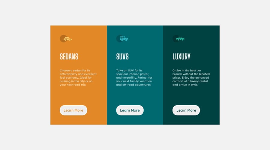
3 column preview card using flexbox

Mtalafa 350

@Mtalafa

Desktop design screenshot for the 3-column preview card component coding challenge

This is a solution for...

  • HTML
  • CSS
1newbie
View challenge

Design comparison


SolutionDesign

Solution retrospective


Hi,

I`m new here and I am new to web development. This is my first challenge. My only question is: Is there a better way to do it? Any feedback is more than welcome.

Community feedback

P
Jacksen 350

@jacksen30

Posted

Hello MTALAFA,

Great Effort on your first Frontend Mentor Project, The first few are always the hardest when first starting to learn.

I've had a look at your CSS and can see some easy changes and refactoring we can do to improve it. I'd recommend looking up these concepts and properties further on MDN for a better understanding but I will give you the simple explanations and suggestions here (this isn't a complete solution but it will go a long way to improving it and helping you on your next challenge) :

CSS Updates & Refactoring

Viewport Height on Body:

Current: The height: 100vh; property is set inside the .container class. Suggestion: Relocate this property to the body element selector. This ensures that the entire viewport height is consumed by the body, providing a consistent base for all internal elements.

Button Hover Effect:

Current: Separate hover effects are defined for btn-1:hover, btn-2:hover, and btn-3:hover. Suggestion: To streamline the CSS and prevent repetition, these can be removed. Instead, enhance the existing .btn:hover rule by adding background-color: inherit, which will ensure the background color remains consistent upon hovering.

Border Radius for Cards:

Current: The cards / overall component doesn't have rounded corners like the design files. Suggestion: Implement the border-radius shorthand property within the individual card classes. This not only simplifies the code but also sets values for all corners in a single line.

For larger screens:

.sedans {
  border-radius: 7px 0 0 7px;
}

.luxury {
  border-radius: 0 7px 7px 0;
}

For smaller screens (in the media query):

.sedans {
  border-radius: 7px 7px 0 0;
}

.luxury {
  border-radius: 0 0 7px 7px;
}

Media Query Breakpoint:

Current: The media query breakpoint is set at 375px. Suggestion: Consider increasing the breakpoint to 500px or more. While the design indicates a mobile view at 375px width, that doesn't dictate the optimal breakpoint. Adjusting this can provide a more consistent user experience across varying screen sizes.

Responsive Design Adjustments:

Current: The design lacks optimal responsiveness, especially for mobile screens. Suggestion: To enhance mobile compatibility:

Update the .container within the media query to employ flex-direction: column and adjust its width to 95% for better spacing.

Remove the max-width constraint on .car-choice by setting it to unset. This grants the content more flexibility to adapt to diverse screen widths.

I hope my recommendations will be beneficial for your current and future projects. Keep up the learning and I look forward to seeing more of your projects in the future

Marked as helpful

0

Mtalafa 350

@Mtalafa

Posted

Hello Jacksen,

Thank you for your feedback.

I used the 100vh on the container in order to center it. That is how I learned to center a flexbox container on the screen. Guess I could move it on the body and just give the container a margin top. Inherit will be useful for the future, so thanks for that. Somehow I managed to not see the outside border radius :) And you are right about the media query. I had to use 500 to test it. Hopefully once I become better I can give you some suggestions as well.

Hope you have a lovely day!

1
P
Jacksen 350

@jacksen30

Posted

@Mtalafa thanks for your kind words 😊

You can have a flex-box nested inside another flex-box for example the body can be a display: flex; to centre the .container with the .container been a flex box itself also. It would look something like

body {
  height: 100vh;
  display: flex;
  flex-direction: column;
  justify-content: center;
  align-items: center;
  background-color: hsl(0, 0%, 95%);
}

Id highly recommend watching some Kevin Powell videos for all things flexbox. https://www.youtube.com/watch?v=u044iM9xsWU

Happy Coding 💻

0

Please log in to post a comment

Log in with GitHub
Discord logo

Join our Discord community

Join thousands of Frontend Mentor community members taking the challenges, sharing resources, helping each other, and chatting about all things front-end!

Join our Discord